Eight brands, one system, and seven years of catalogs that came out right.

Marathon Co. · B2B jewelry manufacturer and distributor, Attleboro, Massachusetts Creative Director · seven years · catalogs, product photography, campaigns, B2B and consumer sites Marathon · LeStage · Cape Cod Bracelets · Kiddie Kraft · Convertibles · and three more

They sold to thousands of independent jewellers who ordered off a page. My job was to make every page true, and to keep eight brands from drifting into one.

Role
Creative Director · the design department, seven years
Made
Every catalog, the product photography inside them, trade campaigns, and the pages that sold from them
Scale
Eight brands · 5,000+ products · catalogs with 250–300 items each, at actual size
Hard part
Jewelry is bought by the millimetre, and eight brands must never borrow each other's look

The story ↓

The brief

A 120-year-old company with eight front doors.

Marathon had been selling charm bracelets, lockets and children's jewelry to independent retailers for more than a century. By the time I arrived the company owned eight brands, each with its own retailers, its own catalog, its own season, and between them three different ideas of what a product photograph should look like.

I was hired as the design department. One person, eight brands, a catalog calendar that did not move, and a photography studio in the building that nobody had standardised.
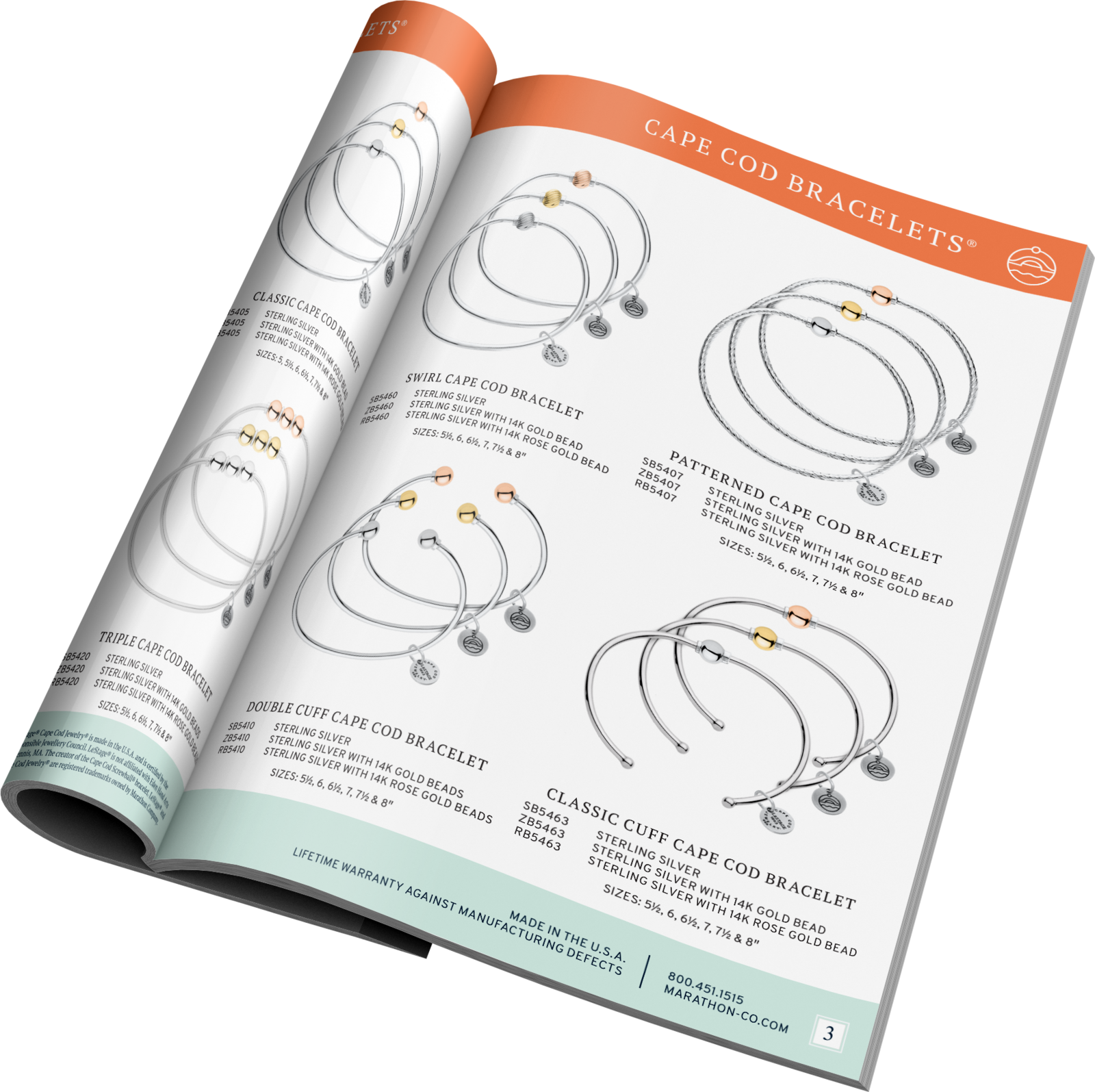
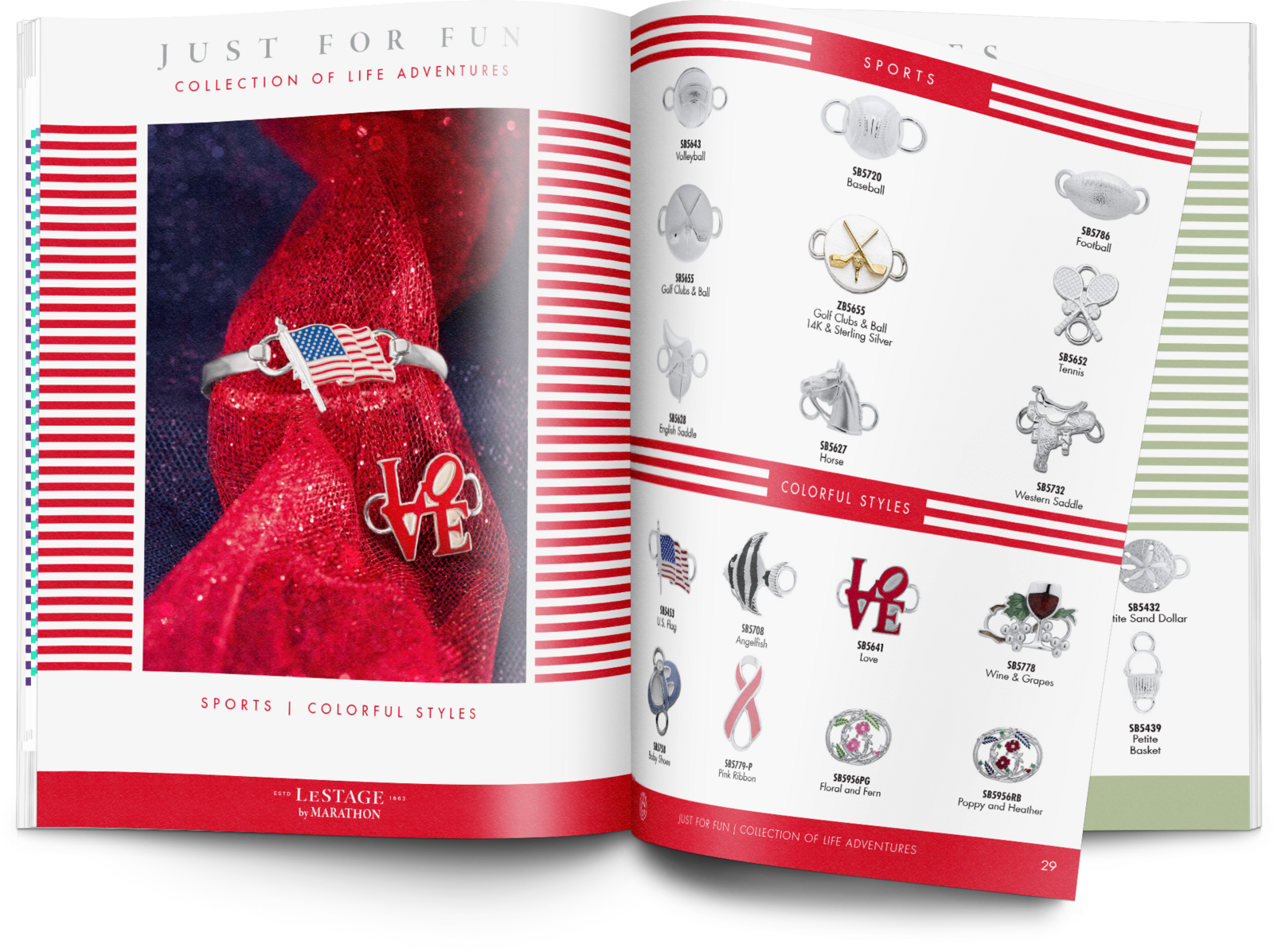
Cape Cod Bracelets. One of the eight. Condensed, approachable, and every item printed at the size it really is, which is the whole reason the page works.
A retailer holds the page up against a customer's wrist. If the picture is the wrong size, the order is wrong.
The hard part

Jewelry is bought by the millimetre.

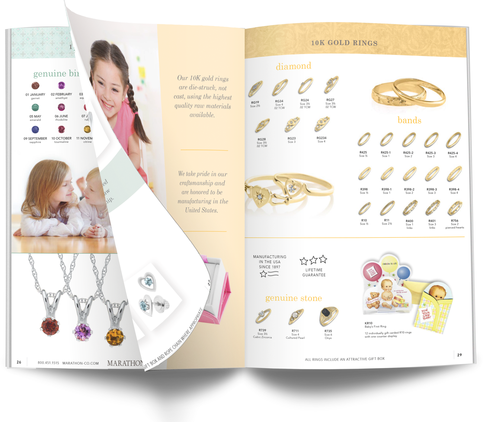
Everything in these catalogs is printed at actual size, so a retailer can lay a bracelet on the page or hold it to a wrist. That one requirement decides almost every other decision: the camera distance, the lens, the lighting, the page grid, the paper, even how many items fit on a spread.

Then multiply it. Thousands of SKUs, several catalogs a year, and eight brands that each had to look like itself: Cape Cod condensed and approachable, Kiddie Kraft warm, LeStage traditional. All of it out of the same studio, the same templates and the same pair of hands.

Gold and silver are also the two hardest things to photograph consistently. Metal shows you the room it was shot in.

One product, one standard. Shot once, to a written setup, then used on the page and on the screen. Two photographs of the same bracelet would have been two different bracelets to a retailer.
What I did

Built so the next catalog was easier than the last.

One photography standard

A fixed setup, written down: distance, lighting, surface, how gold and silver each get treated, and a reference card in the frame so scale could be checked later. Every product shot from then on matched the ones before it.

Scale built into the template, data entered once

Page grids where the 1:1 rule was part of the master, not something to remember, so a junior could place a product and have it come out at true size. Style numbers, metals, lengths and prices came from one source and flowed into the catalog and the website instead of being retyped into both. Retyping is where catalogs lie.

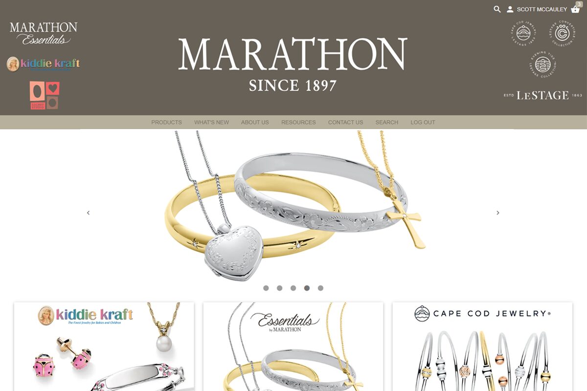
The B2B store. Where retailers actually ordered, fed by the same product data and the same photography as the catalog. Nobody retyped a price into it.

Eight voices on one chassis

Each brand kept its own type, colour and tone. The grid, the photography and the workflow underneath were shared. That is what let one person serve eight brands without flattening them.

Kiddie Kraft
Convertibles
Two more brands, same chassis. Kiddie Kraft warmer and softer, Convertibles plainer, and the grid, the photography standard and the production underneath identical. The differences are decisions, not accidents.

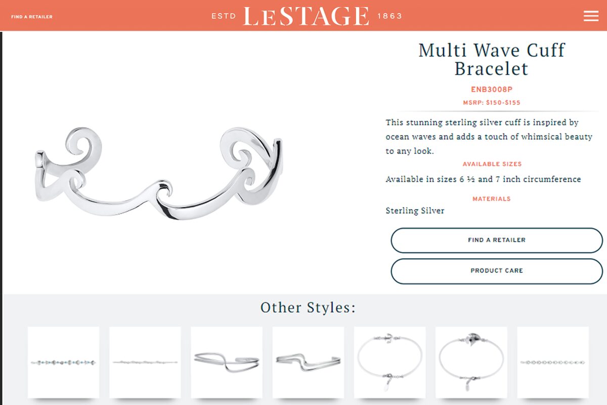
The B2B store and LeStage's consumer site drew on the same photography and product data, so they stayed in step with the catalogs without anyone minding them.

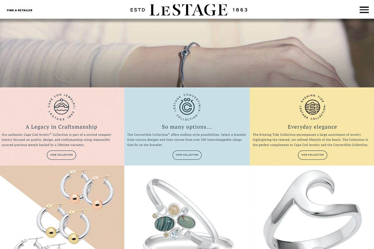
LeStage, consumer-facing. A different audience from the trade catalogs, in step with an identity the catalogs had already set.
What happened

Nobody notices a catalog that is right.

Seven years, eight brands, and a release calendar that never slipped. Two brands were added after the system existed, and both shipped their first catalog without any new production being invented for them.

Retailer complaints about wrong sizes and mismatched photography stopped.

No testimonial, and none asked for. Seven years on the same account says it.

Why it matters to you

A system is what lets one person serve eight brands.

This is the work behind everything else on the site. A concert poster and a jewelry catalog have the same problem underneath: many pieces, one identity, a date that does not move, and a printer at the end who needs the file to be correct.

For your version of it I would start the same way: the photography standard before the photography, the template before the pages, one source for the data.

Have something like this? Email me.

Tell me what you're making and when you need it. I reply within a day. What to include

Next case study · 2 of 2 New American Philharmonic: every concert different, one orchestra →