My identity is your brand, working everywhere.

Identities, catalogs, posters, programs, handouts, and the systems that keep the last one looking like the first. Brand and production design, most of it as a one-person department.

Identity and brand systems · Design frameworks · Catalogs and print production

Marathon Co.
7 years · eight jewelry brands, as the design department
New American Philharmonic
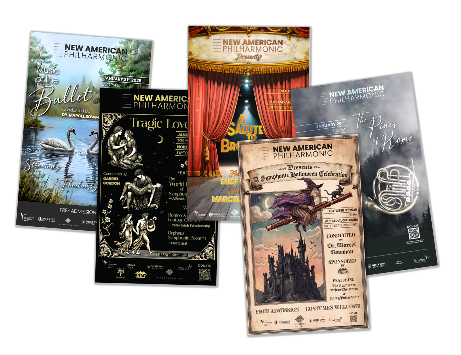
Season after season · every poster and program, one frame
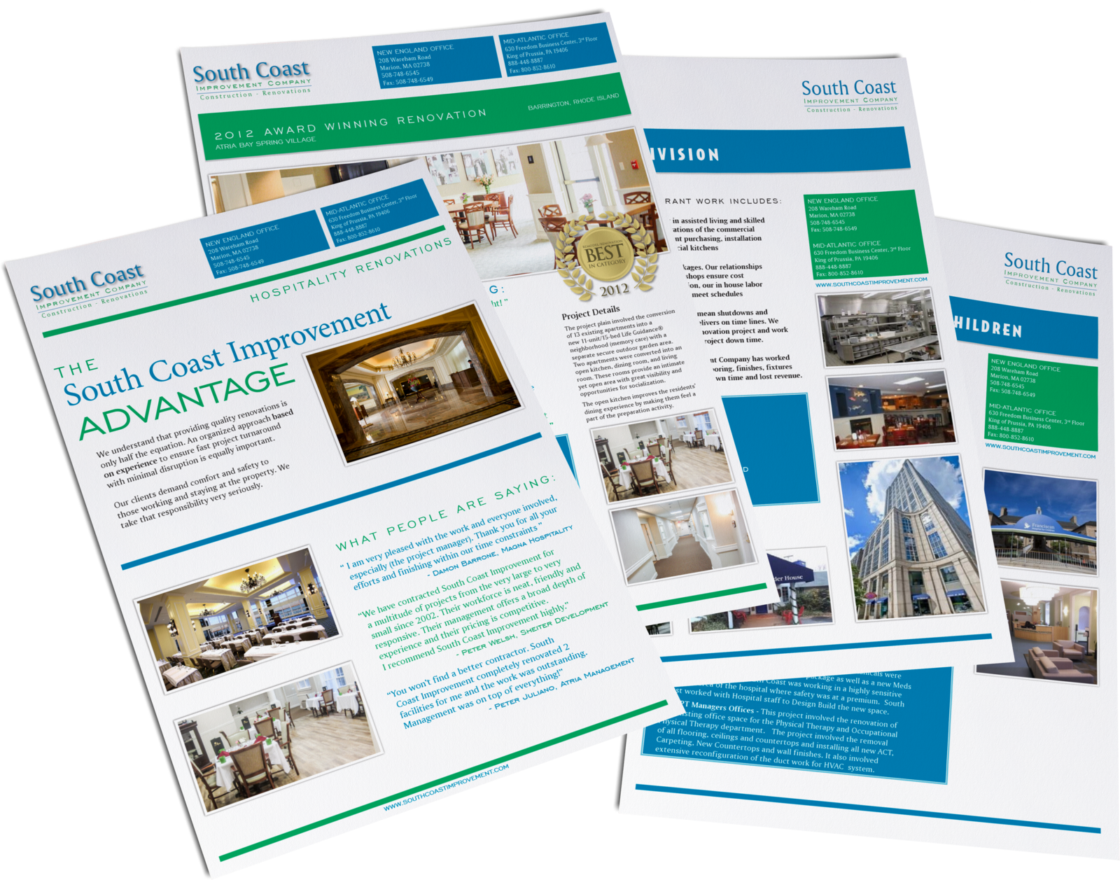
South Coast Improvement
One frame · tri-fold, folder, brochure, a sell sheet per job
Also featured
Five more jobs · a catalog, pins, mailers, merch and a university, held to the same standard
Taking on new work
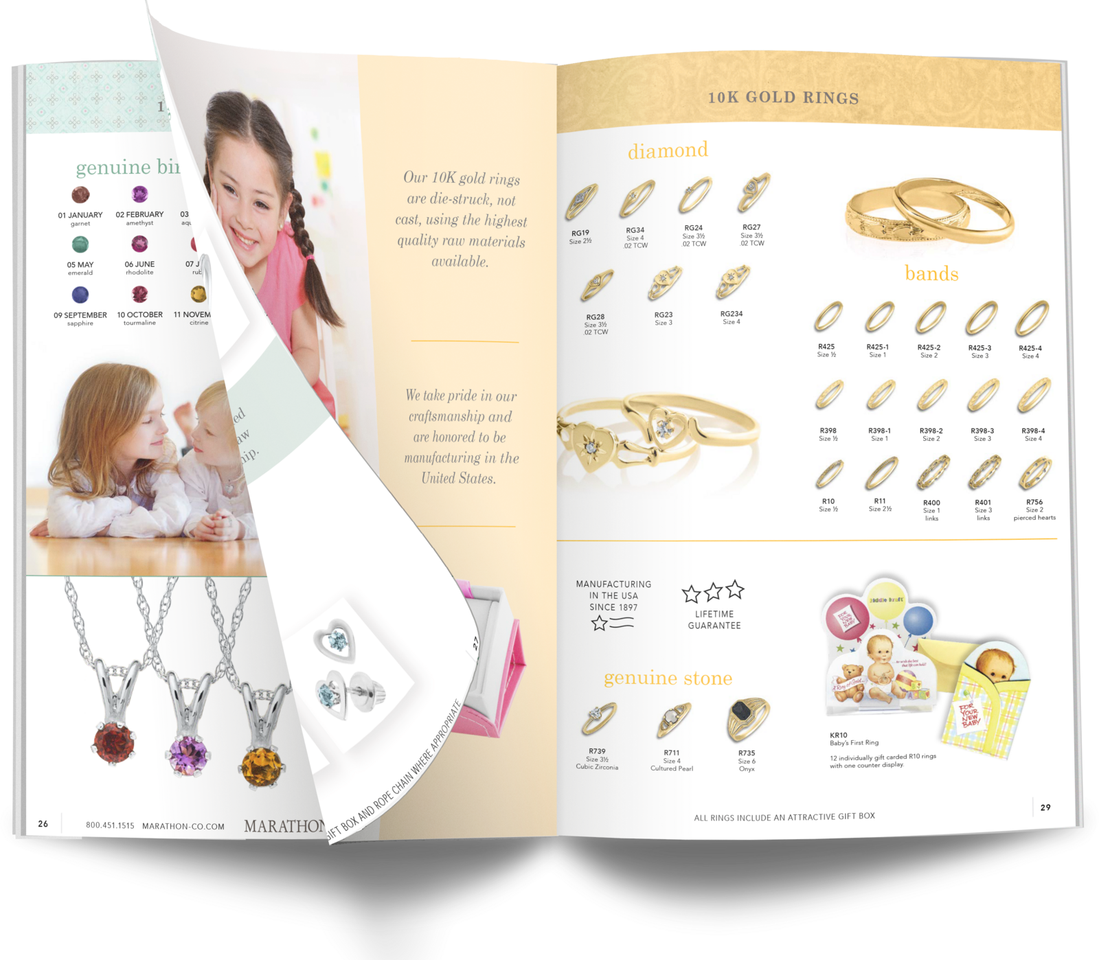
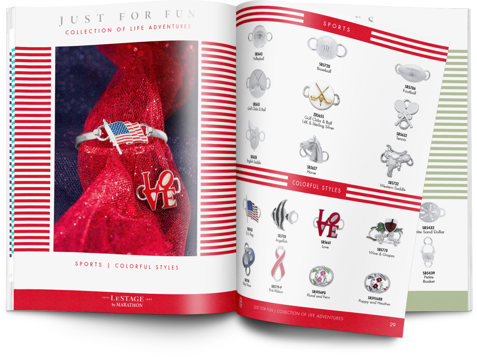
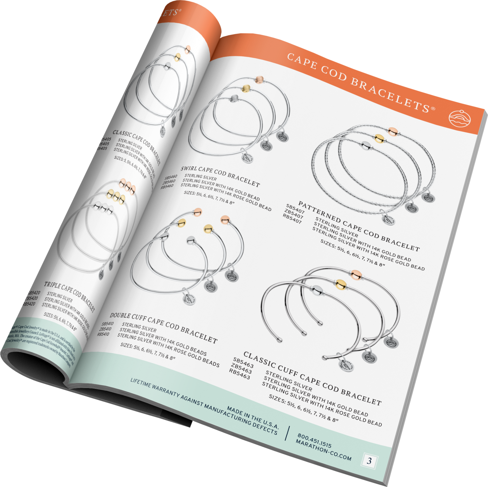
Cape Cod Bracelets catalog. Condensed and approachable, every item at actual size so a retailer can hold a wrist to the page.
Kiddie Kraft. 32 pages, over 300 items, photography shot in-house. Same production system as the others, its own voice.
Convertibles. 32 pages, 250 items, indexed with a table of contents. The third brand on the same page grid.
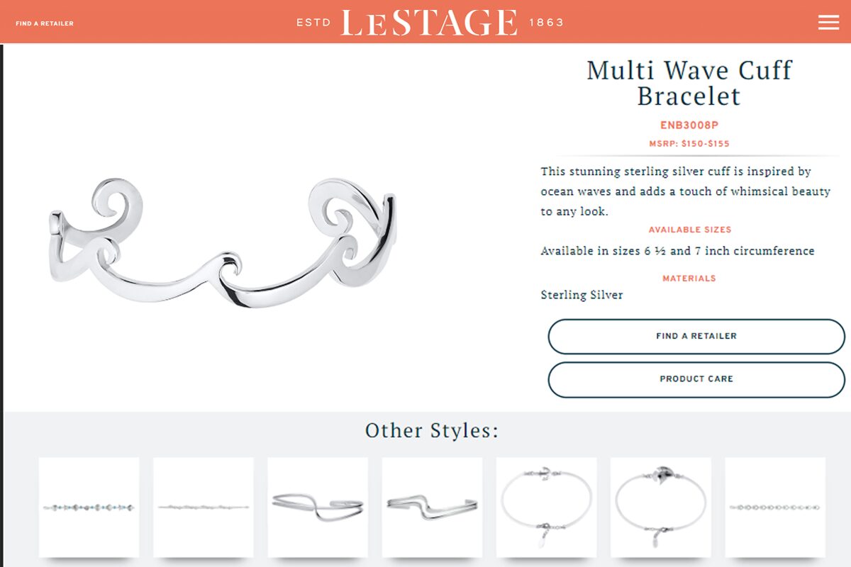
The catalog's photography standard, re-used on screen. One shoot, one standard, two places to sell from.
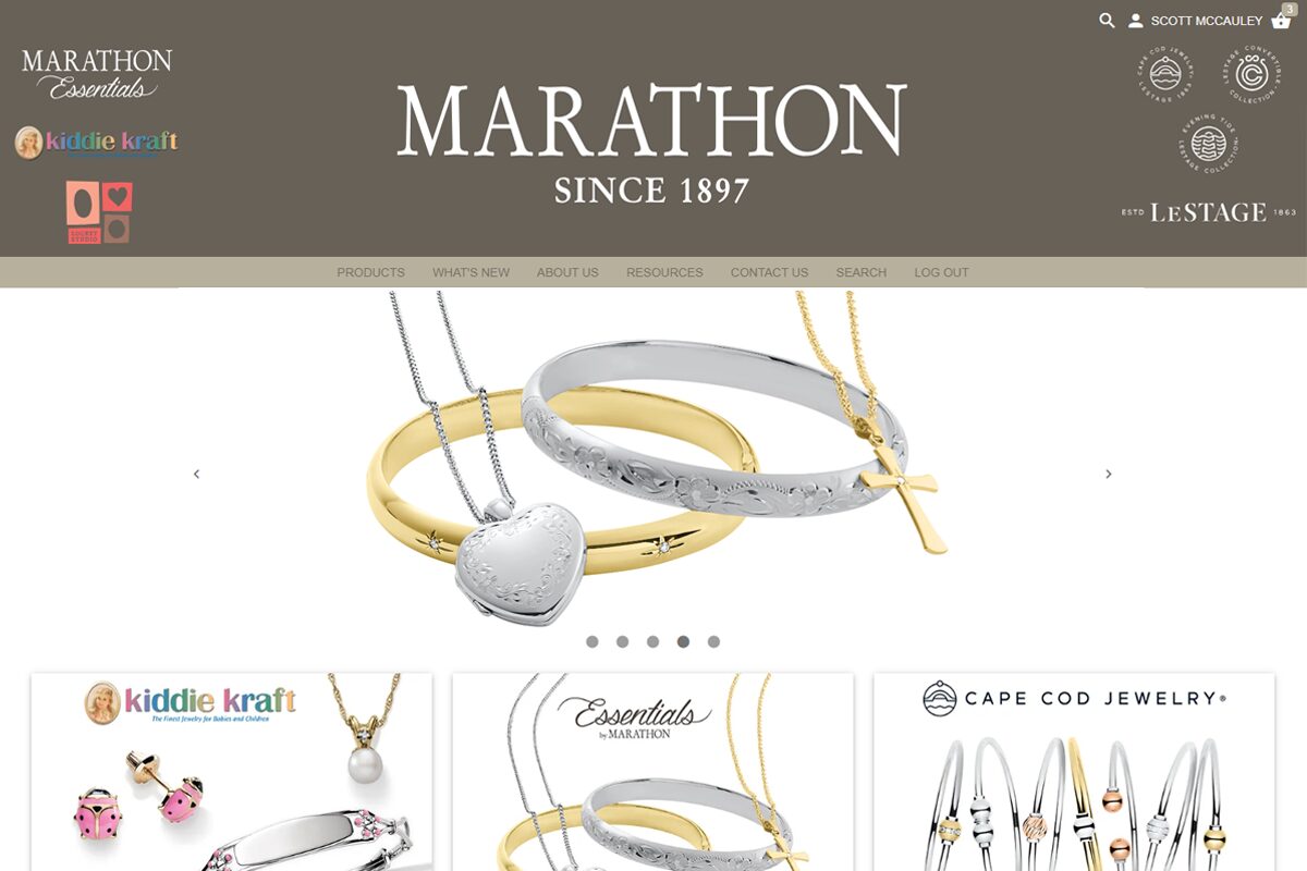
Where the retailers ordered. Over 5,000 products, organised by the same logic as the printed pages.
Marathon Co. · B2B jewelry, eight brands, thousands of independent retailers Creative Director · seven years

Eight jewelry brands that had to stay eight brands.

I made everything the company put in front of thousands of independent retailers: catalogs, the product photography inside them, trade campaigns, and the pages that sold from them. Over 5,000 products, eight brands, seven years, one department.

The hard part

Jewelry is bought by the millimetre. Every piece is photographed to one standard and printed at actual size: thousands of SKUs, on a catalog calendar, for eight brands that each had to keep a look of their own.

Read the story
New American Philharmonic · community orchestra, free admission, sponsor-funded Design, production and print handoff · season after season

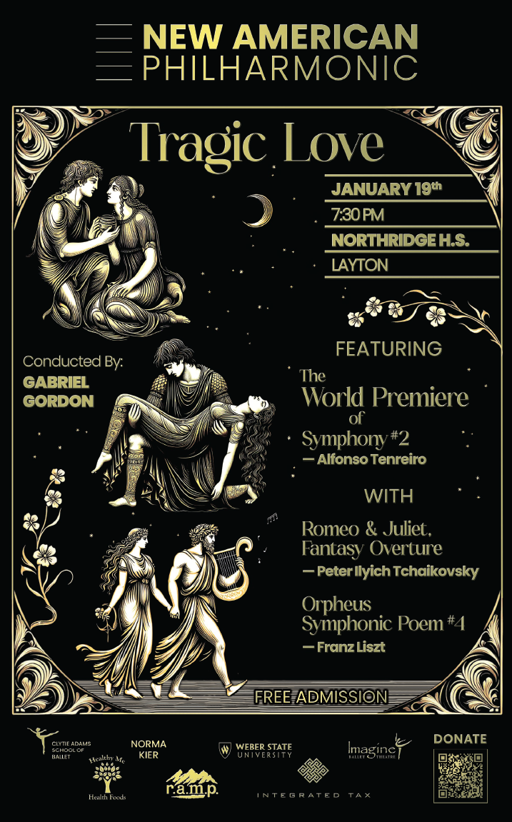
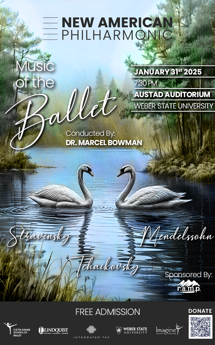
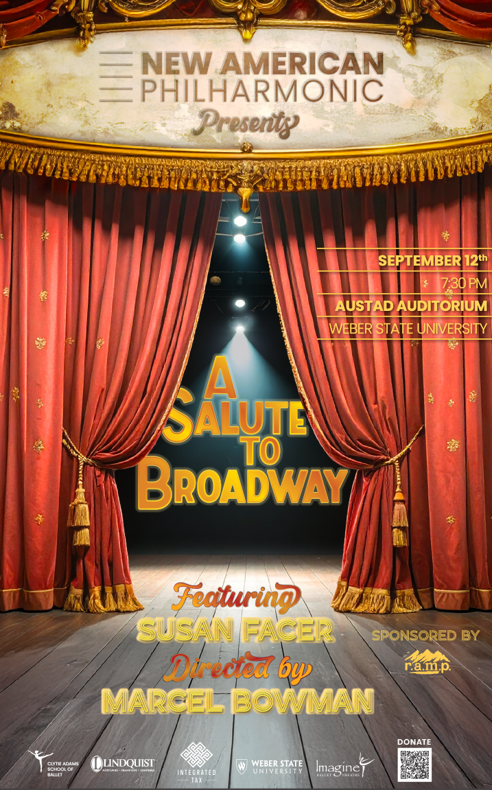
A different mood every concert, one orchestra you recognise across a lobby.

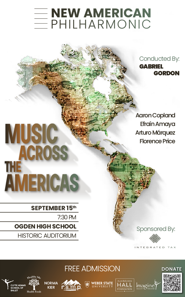
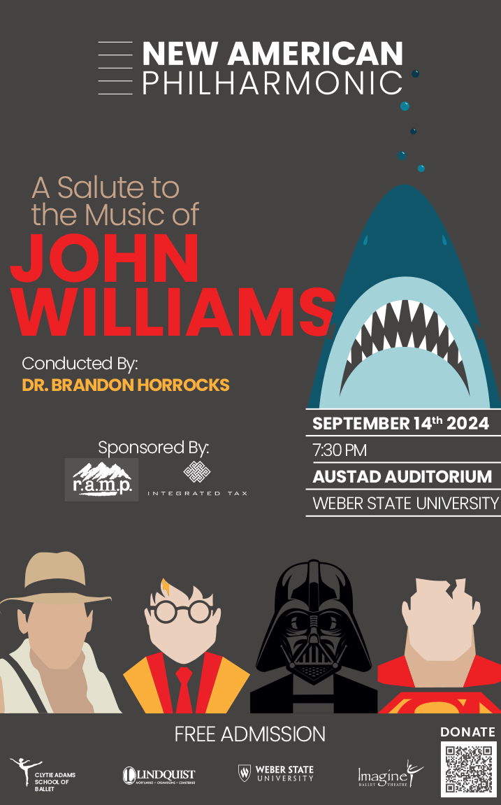
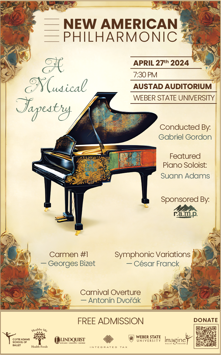
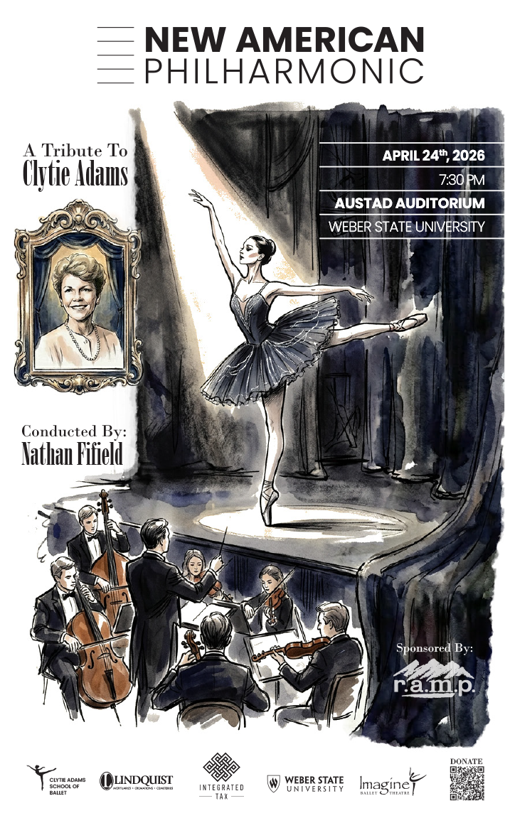
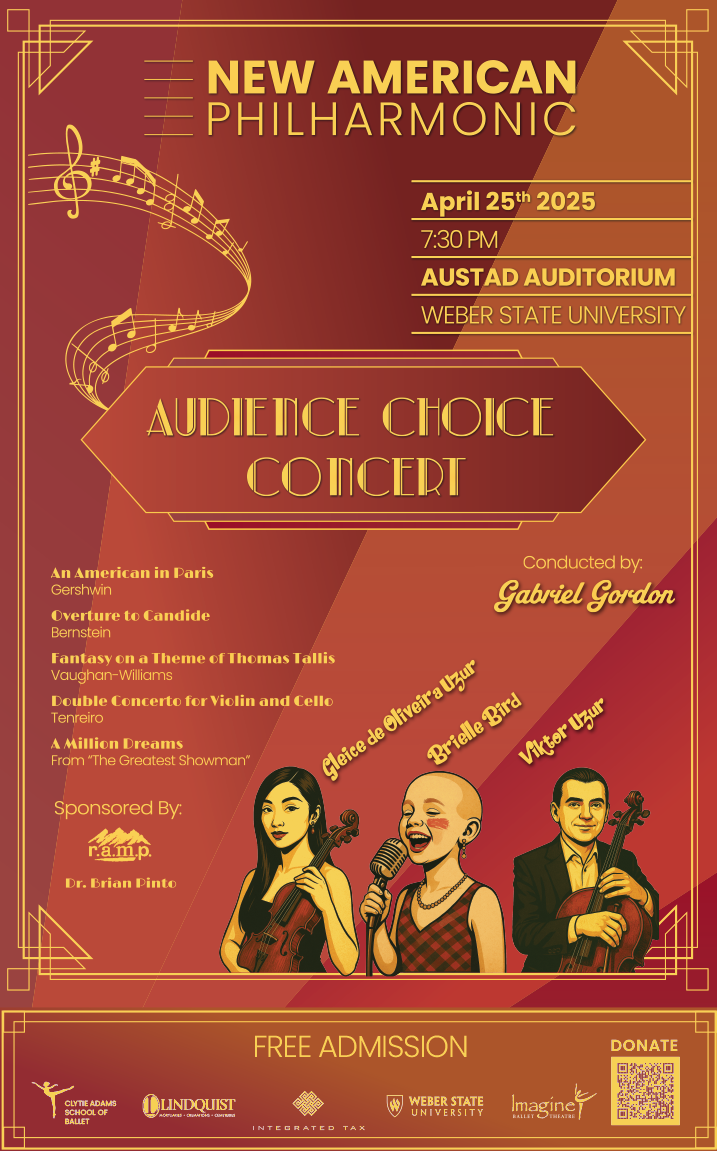
Every concert needs two poster sizes, a program, digital promos and the venue ad. The music changes every time. The masthead, the date block and the sponsor row never do. Seasons in, no two posters look alike and the frame has not moved.

The hard part

Sell the music and carry the sponsors in one glance, then do it again next month for a different composer without looking like a different orchestra.

Read the story
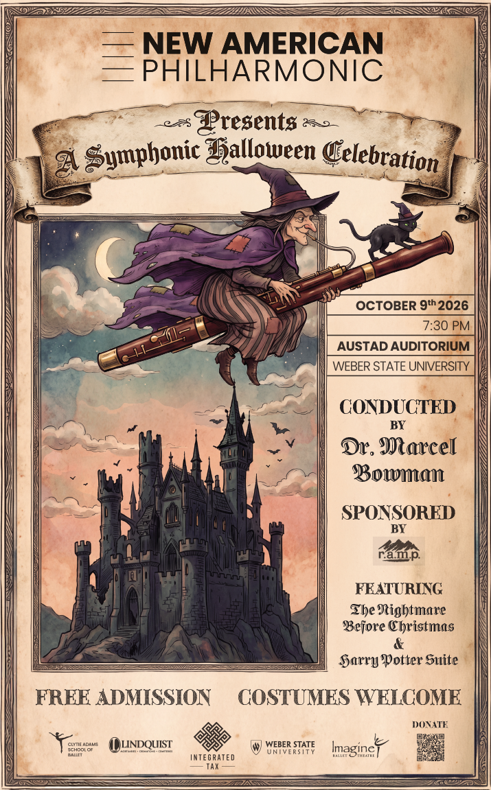
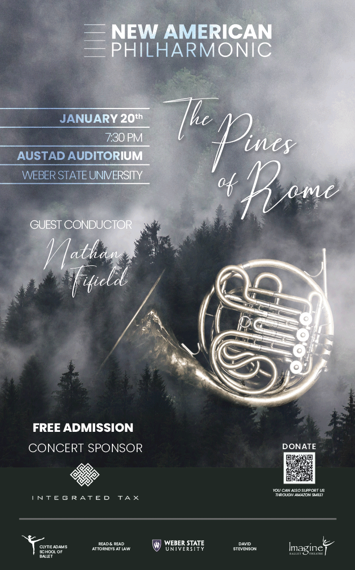
Music of the Ballet, Tragic Love, A Salute to Broadway, the Halloween concert, The Pines of Rome.
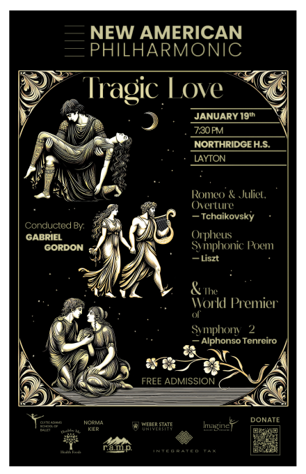
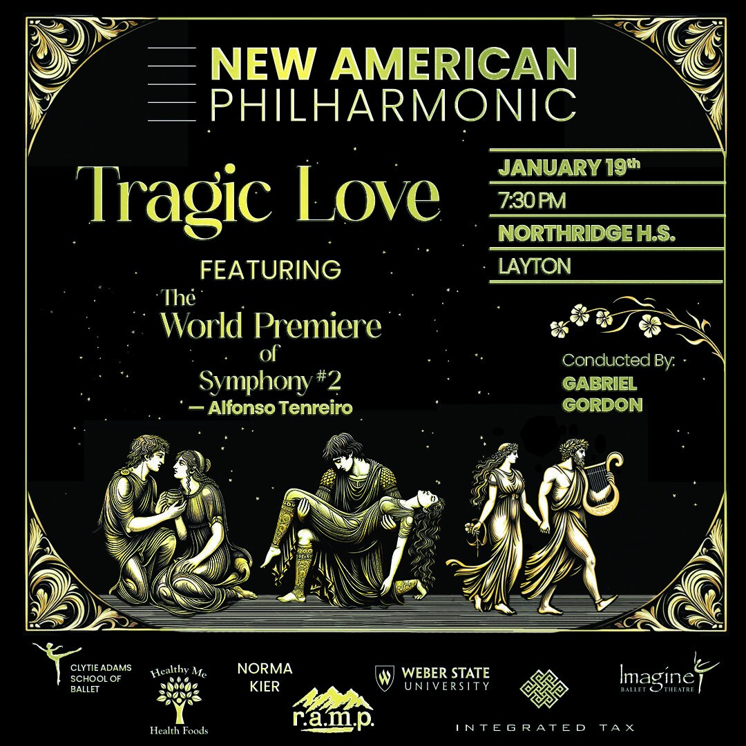
Tragic Love. Gold on black. Three days from the first draft.
Music of the Ballet. Different world, same masthead.
A Salute to Broadway
A Symphonic Halloween Celebration
The Pines of Rome
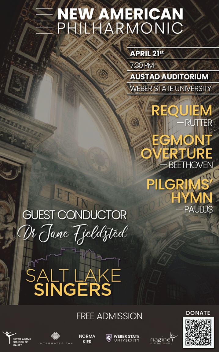
With the Salt Lake Singers
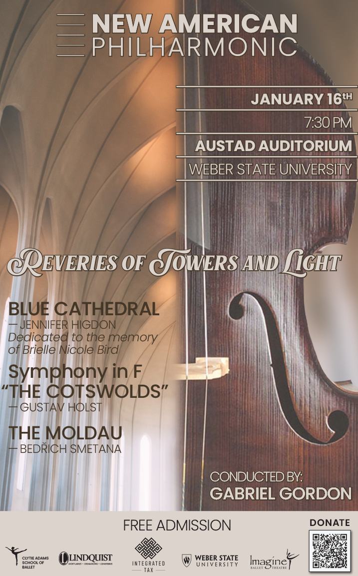
Reveries of Towers and Light
Music Across the Americas
A Salute to the Music of John Williams
A Musical Tapestry
A Tribute to Clytie Adams
Audience Choice Concert
Tragic Love, draft one.
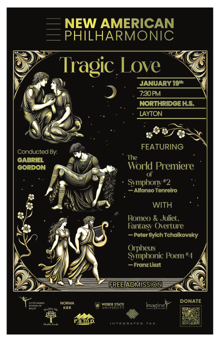
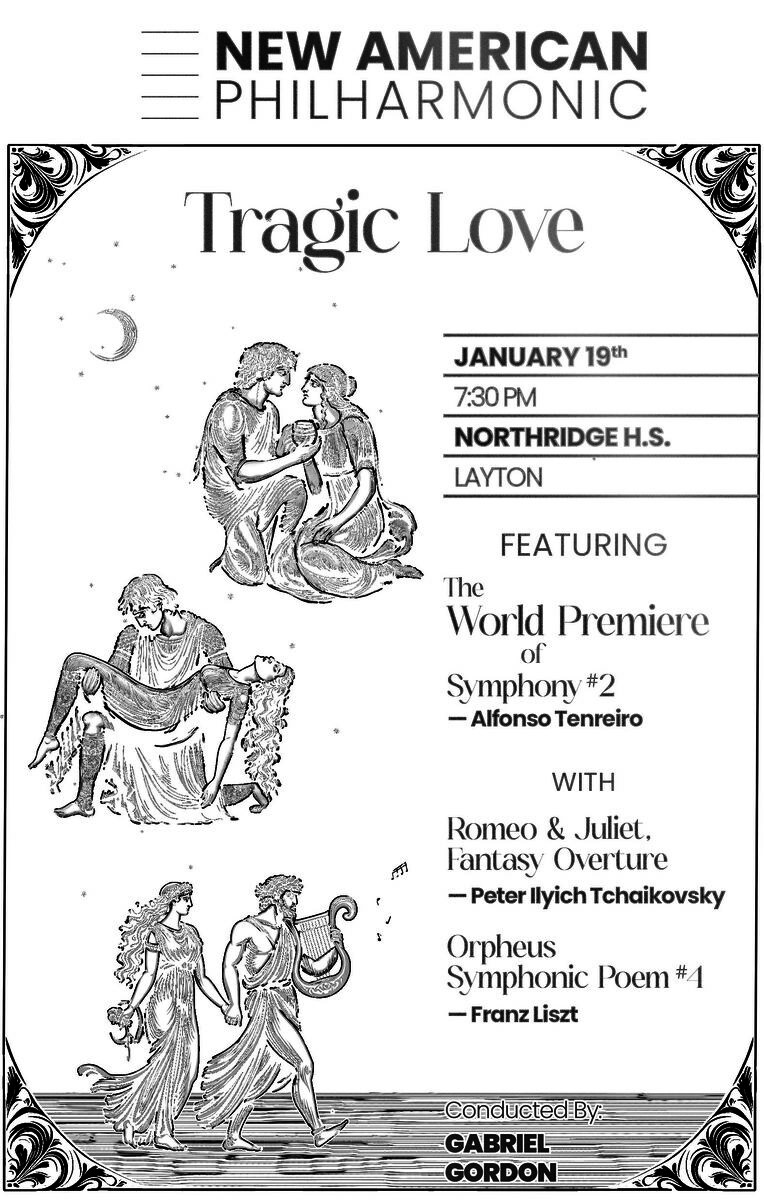
Draft two, same day, the "Featuring" layout.
The program. Same frame, folded down to letter.
Social crop. A mauve colourway was used for the digital pieces.

Look at the bottom of each poster: same masthead, same date block, same sponsor row, every time.

South Coast Improvement · construction and renovation, residential and commercial Design and print production · the whole leave-behind set

A builder with a logo and nothing to hand out.

They had a mark and no printed matter to go with it. I built the rest around it without touching it: a tri-fold for the residential side, a full brochure for the commercial one, a pocket folder to carry it, and a sell sheet for every kind of job they wanted to be hired for again.

The hard part

Two different buyers, a homeowner and a facilities manager, read the same company in the same afternoon. One frame has to speak to both, and the next sell sheet has to be an afternoon's work rather than a redesign.

Read the story
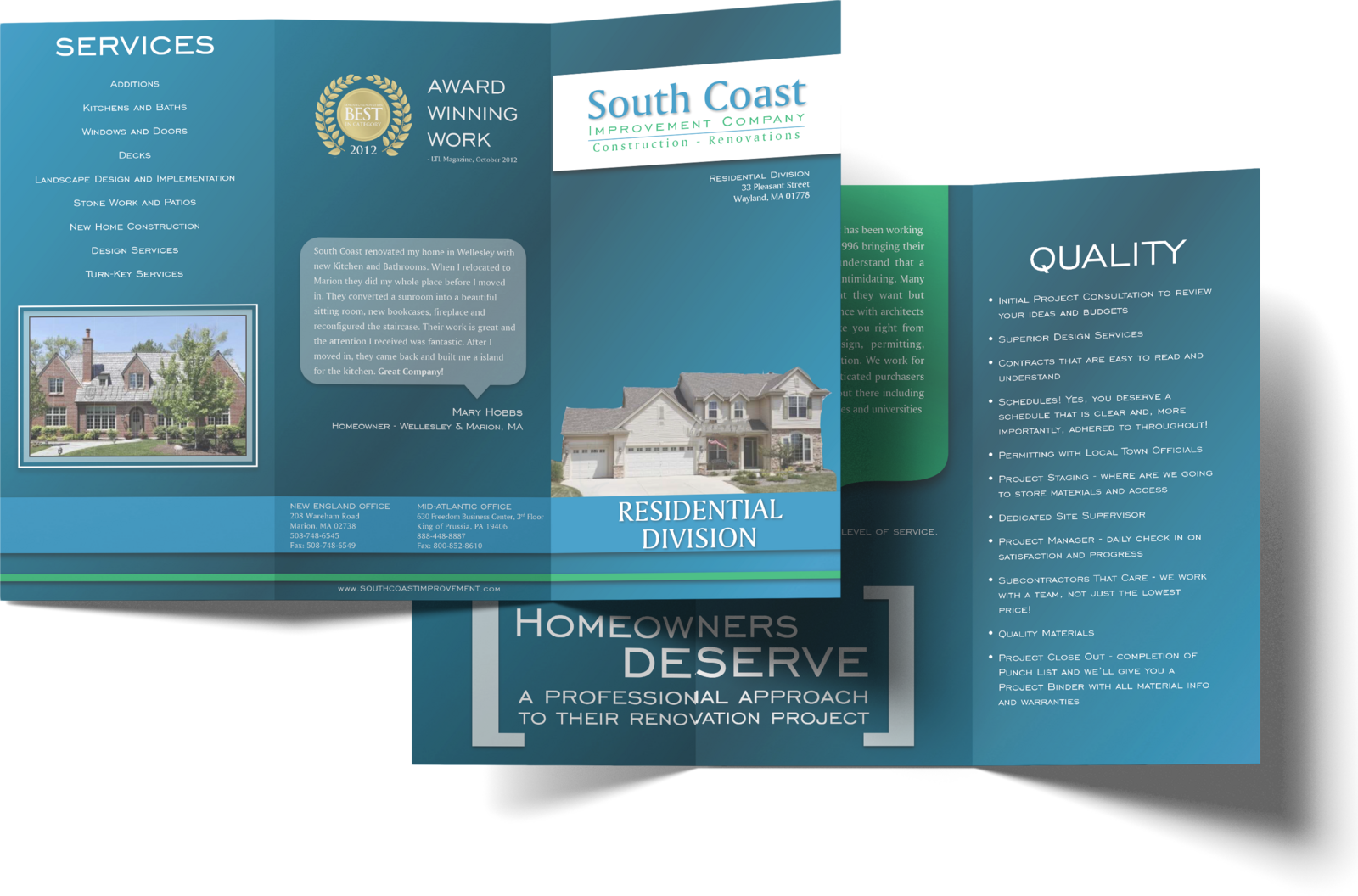
The tri-fold, open. The residential side: services on one panel, the promise to homeowners on another, the house on the cover.
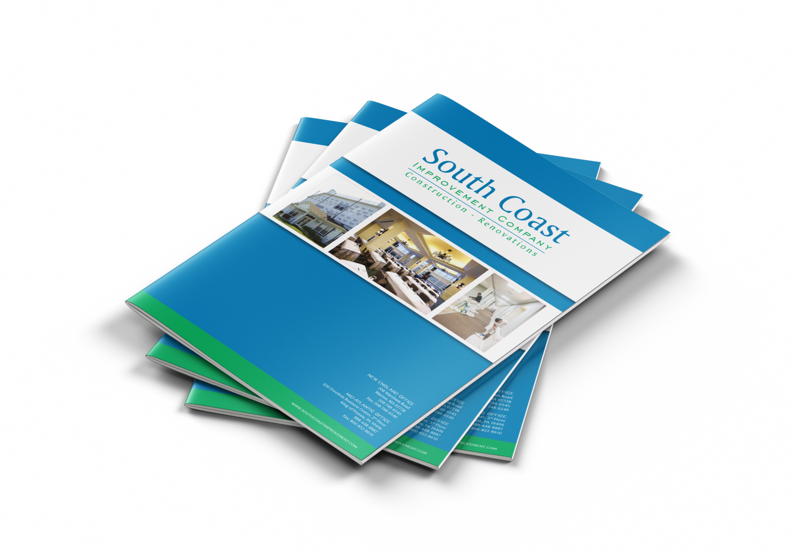
The brochure. The commercial side's cover: the mark on a white band, a strip of finished work, the two offices along the foot.
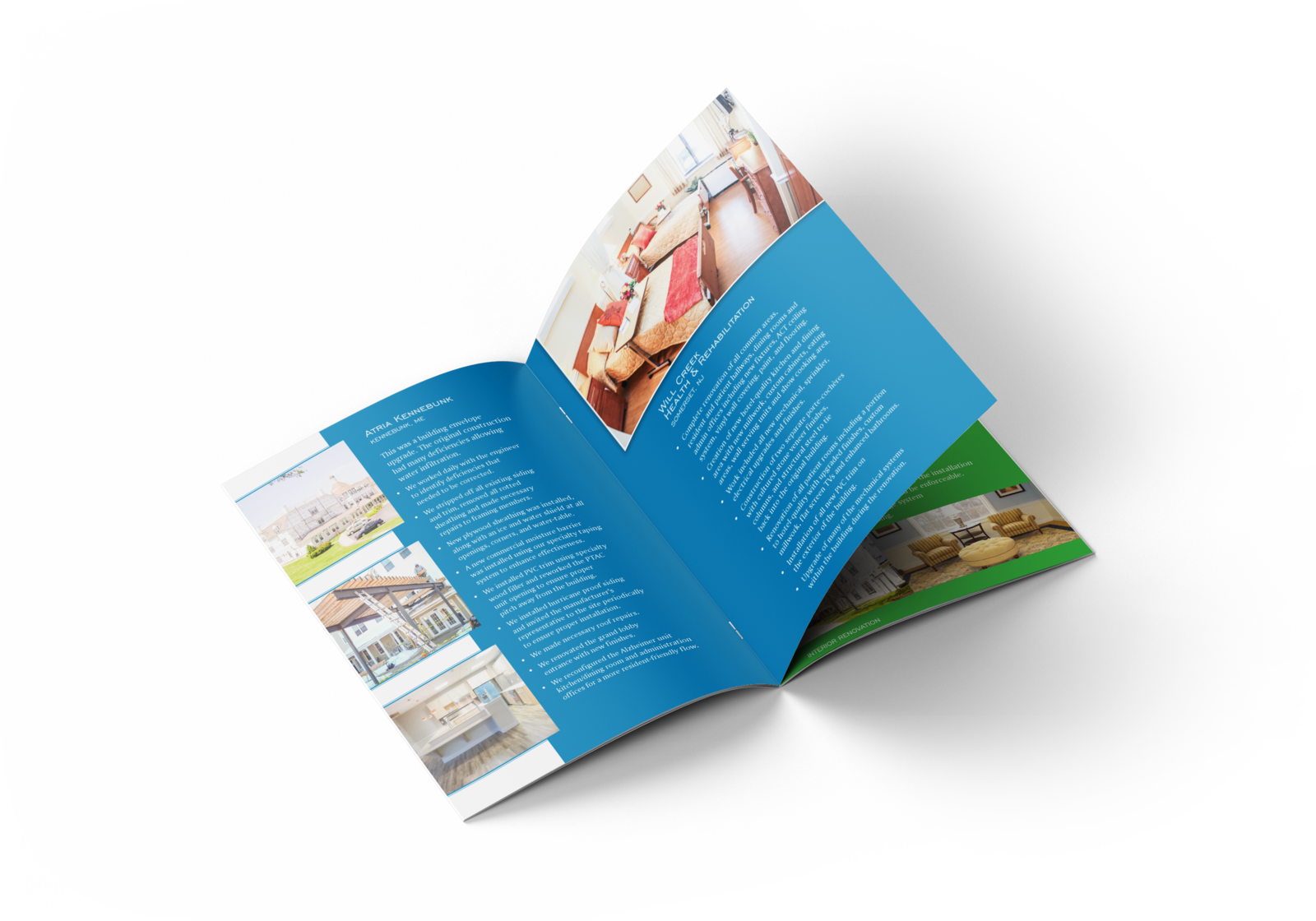
Inside the brochure. A spread of completed projects, each with its pictures and its facts in the same places.
The sell sheets. A series, one per finished job across every industry they work in, on one frame, so a prospect is handed only the ones like theirs.
Also featured

Other jobs, other clients, the same standard.

The work has never stayed in one field or one market: scientific equipment, financial services, youth sports, a curling club, a university. Each audience wants a different look and a different voice, and the finished thing has to be right for them, not for a house style. A few of those jobs, most with a page of their own.

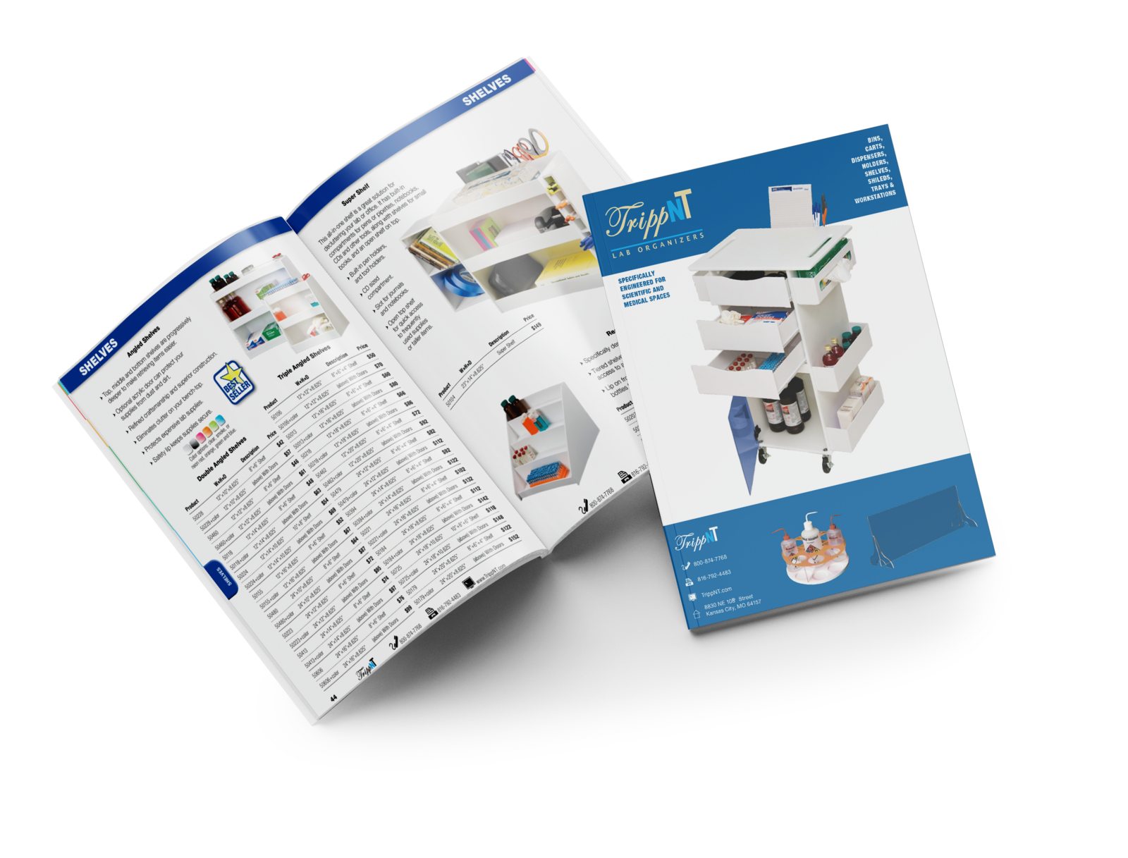
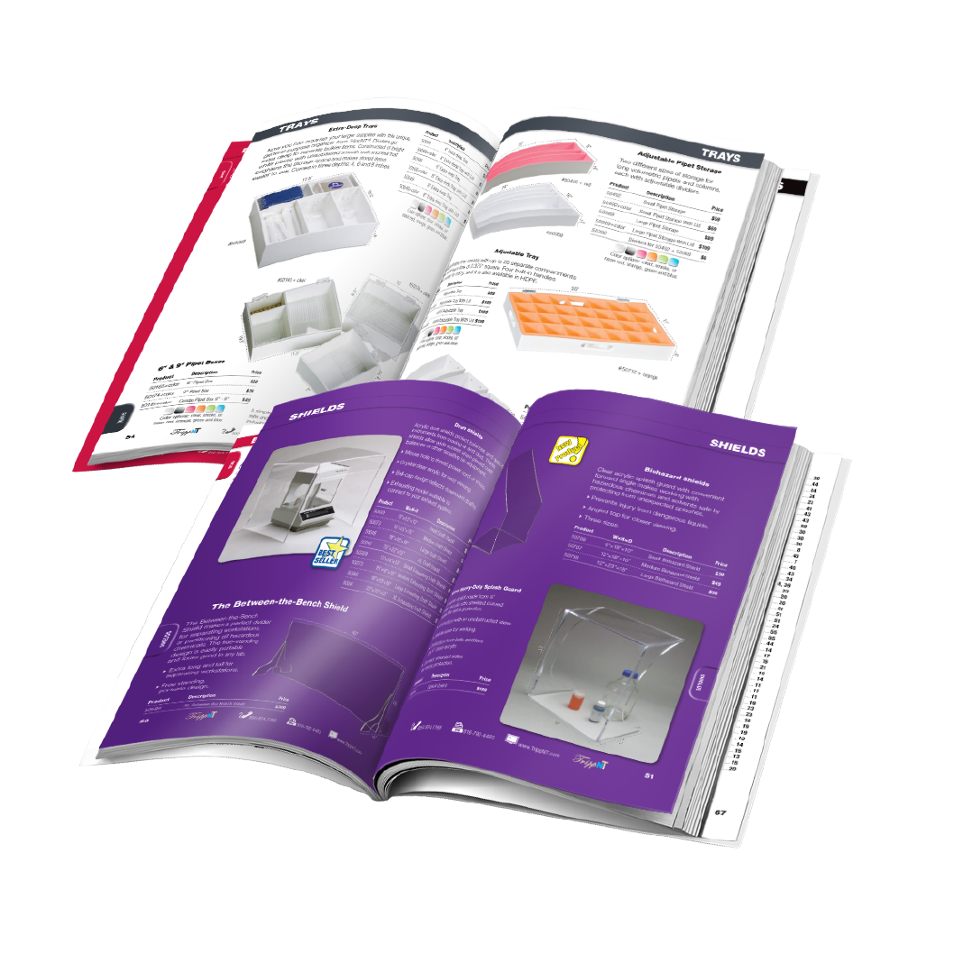
TrippNTA 68-page catalog of laboratory benchtop organisers, most of it white plastic on a white page: the products photographed, nine colour-coded sections, part numbers in the same place on every page.
Trays, then Shields. Two of the nine colour-coded sections, open: the section's colour on the tab, the page edge and the heading, so a reader flipping through lands on it by colour before reading a word.
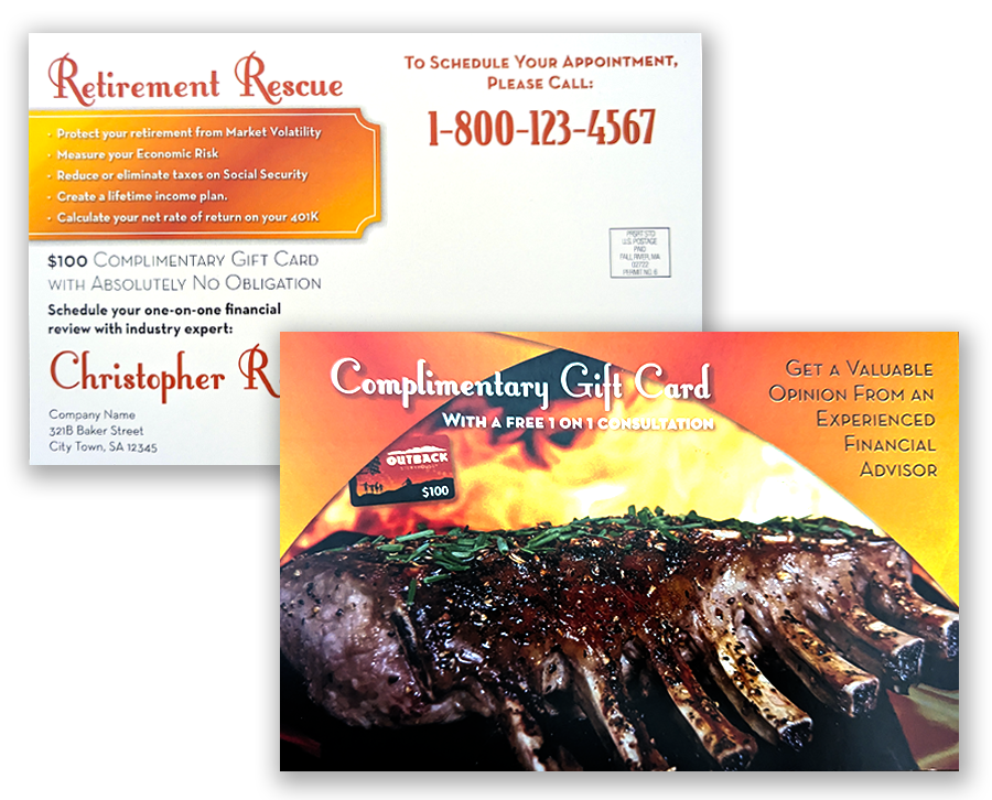
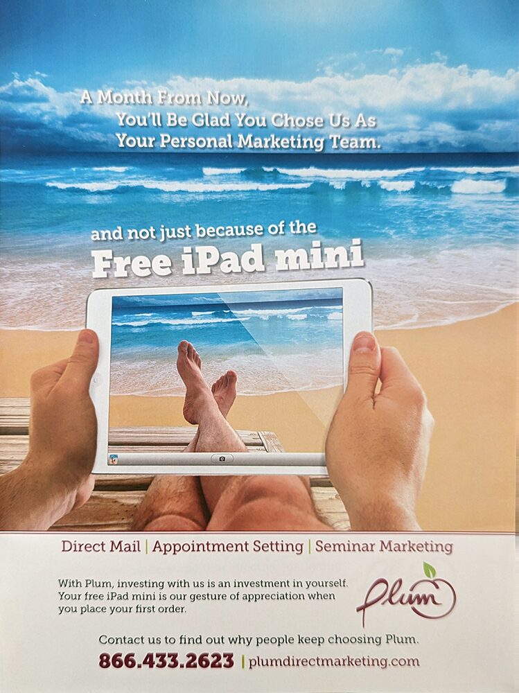
Direct marketing piecesFour seminar postcards for financial advisors and tax preparers, and the agency's own magazine ad.
College financial planning night. A classroom on the front, three seminar times and the mail panel on the back.
Plum's own magazine ad. The agency selling itself, to its own standards: one beach, one promise, the offer in the headline.
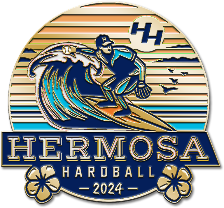
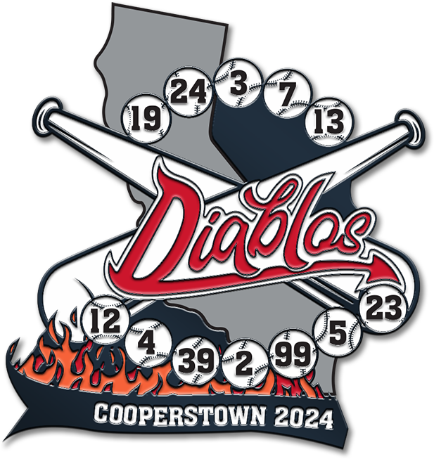
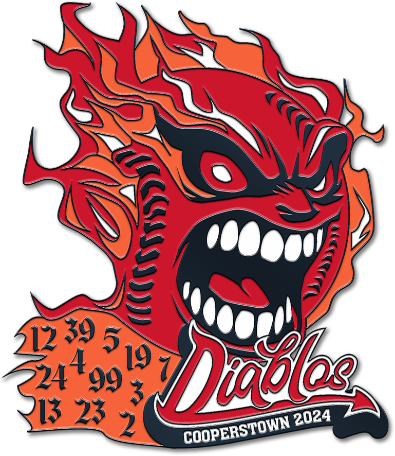
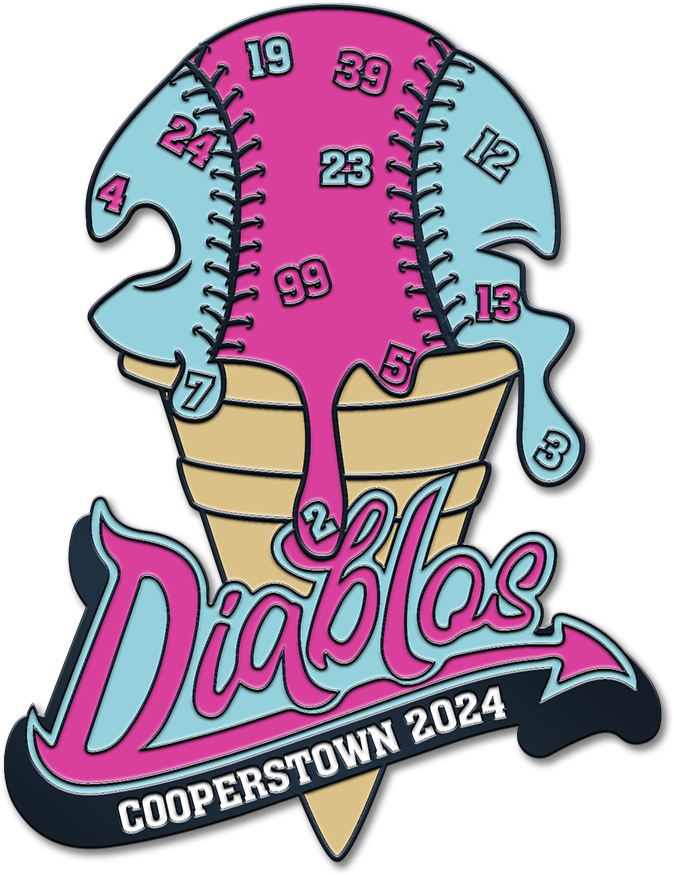
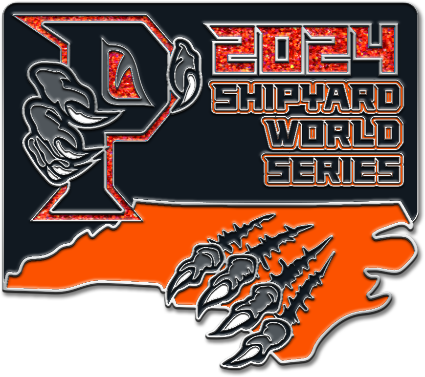
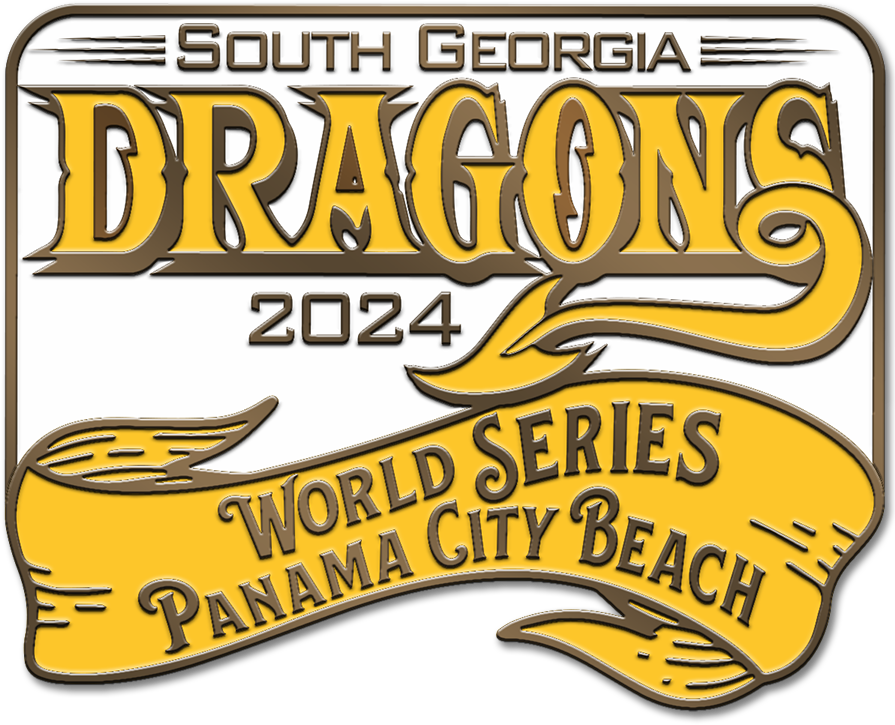
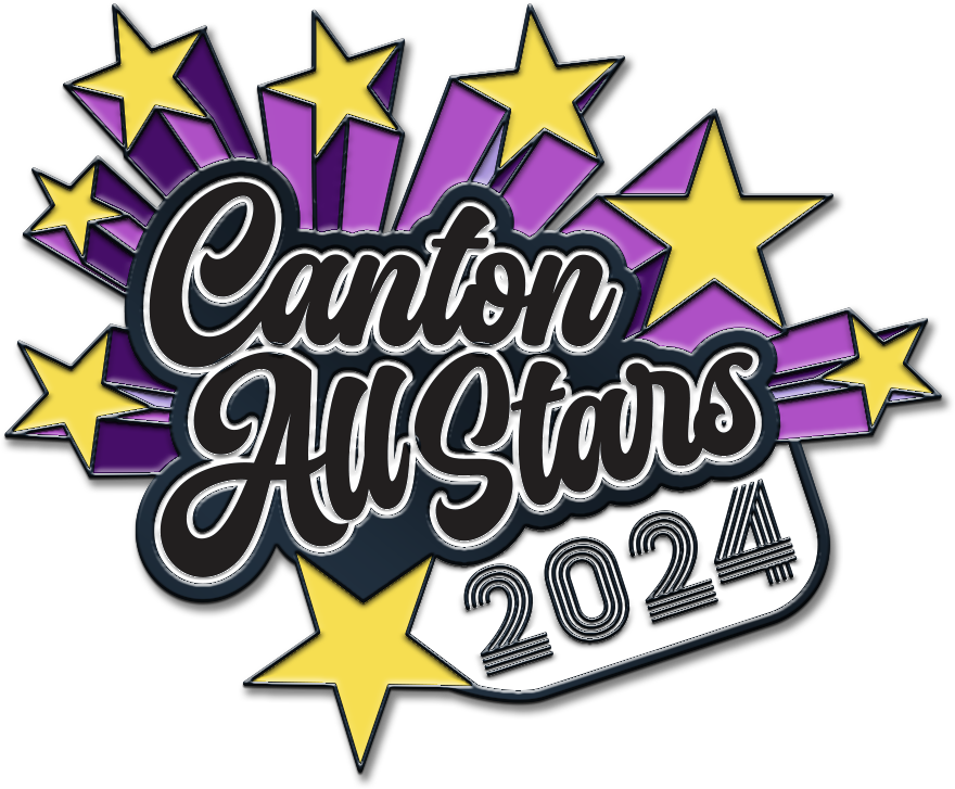
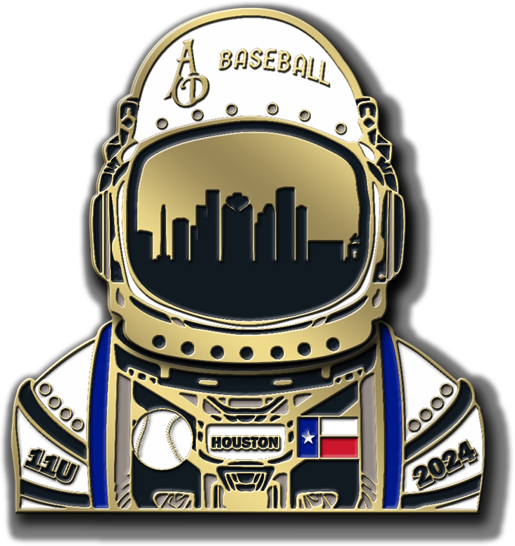
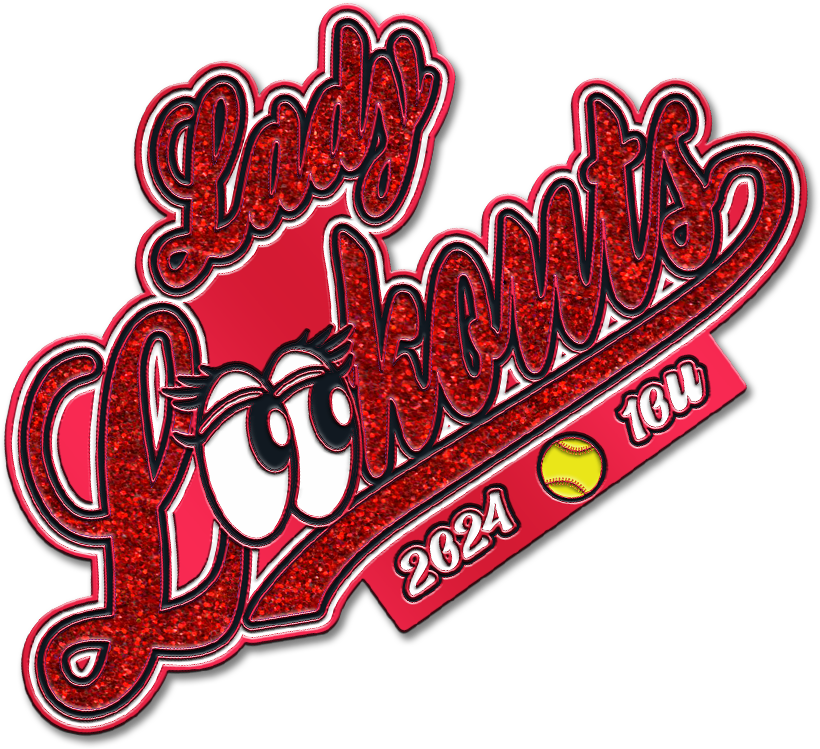
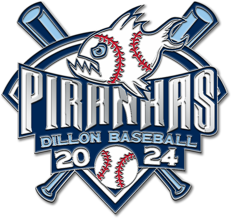
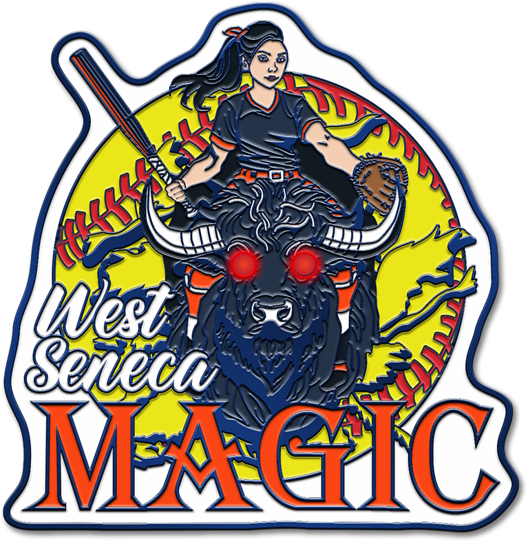
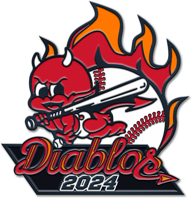
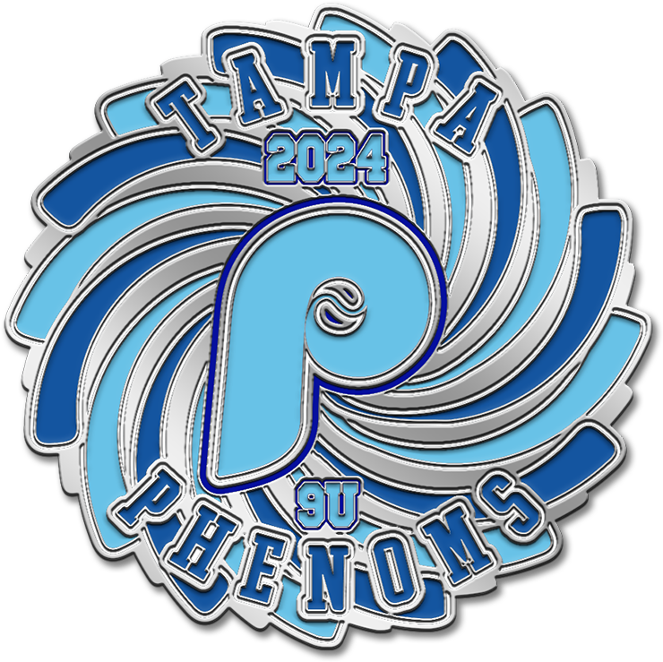
Trading pinsTournament pins for youth baseball teams from Hermosa Beach to Muscle Shoals, too many to count.
Diablos, the chain. One of three pins that interlock: crossed bats over the state, the roster numbers in the balls.
Diablos, the flaming ball. The second of the three; the roster numbers sit in the flames.
Diablos, the melting cone. The third: a cone of baseballs, the numbers in the scoop.
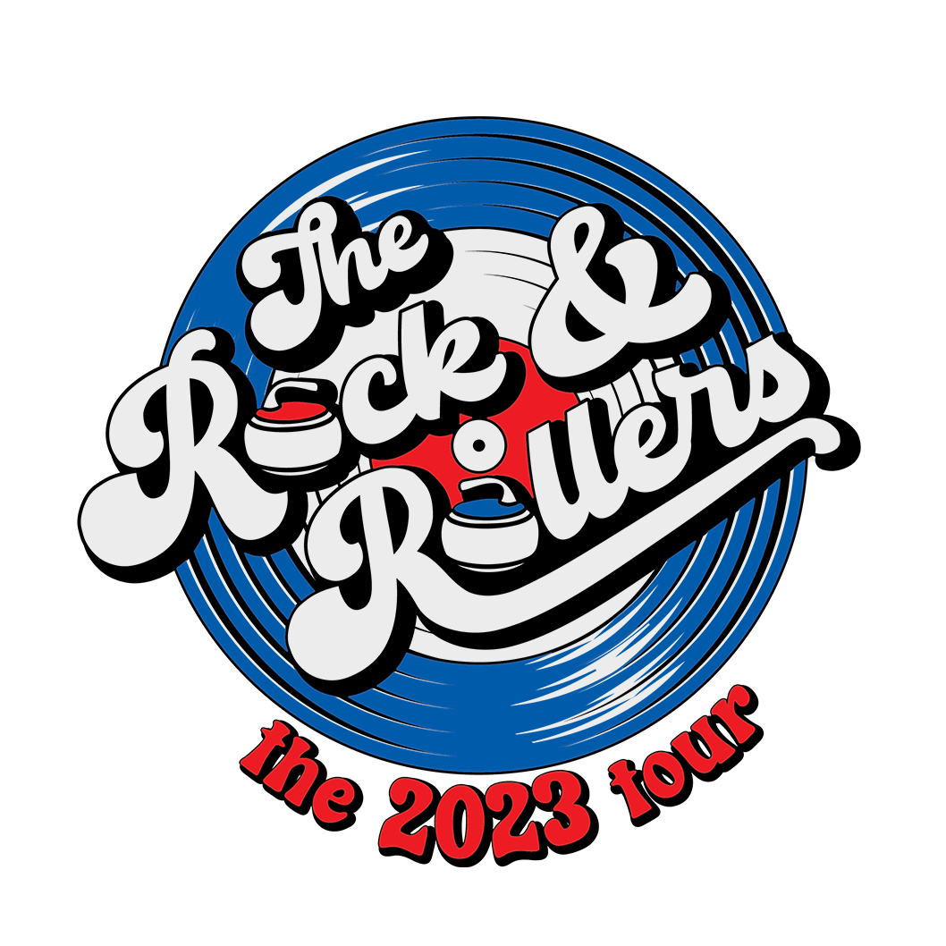
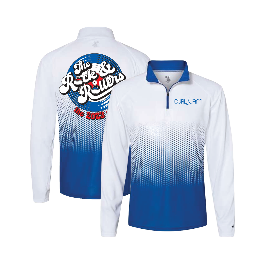
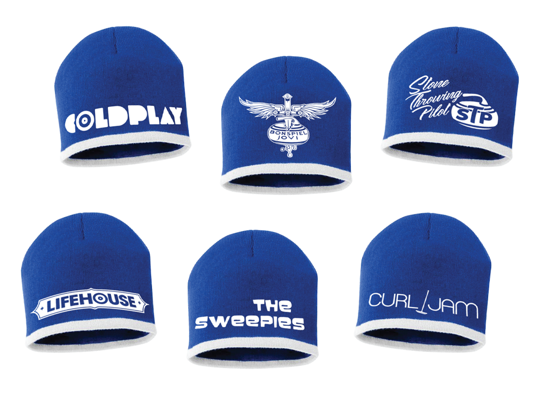
The Rock and RollersA pun-filled identity for a curling team that leans into rock and roll: the mark set in a vinyl record, and a band name for every player.
The quarter-zip. The mark on the back over a halftone fade; the player's alias on the chest.
The beanies. Coldplay, Bonspiel Jovi, Stone Throwing Pilot, LifeHOUSE, The Sweepies, Curl Jam, each lettered the way the band does it.
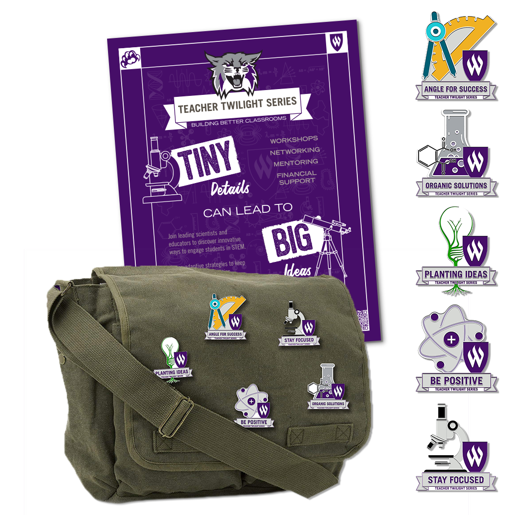
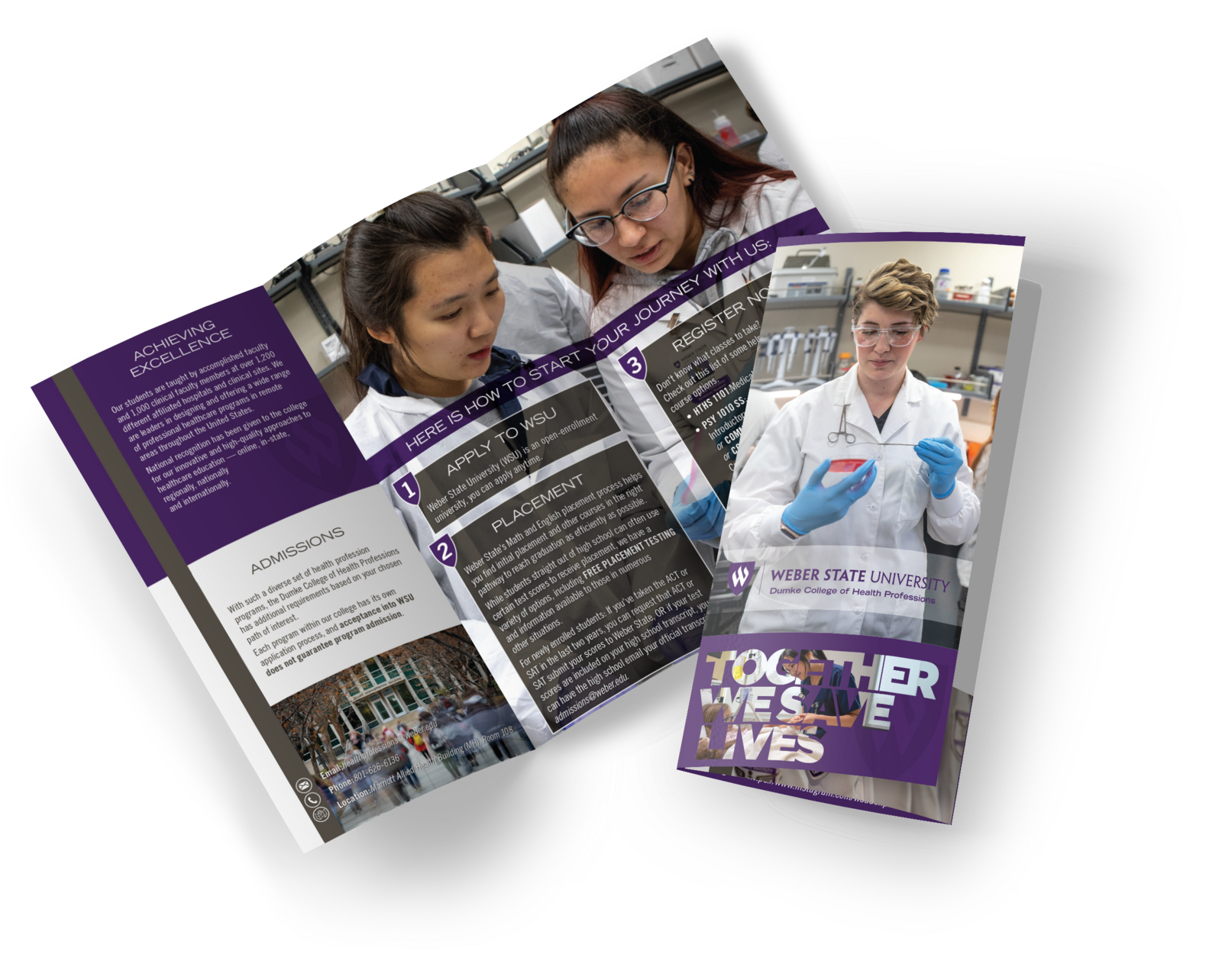
Weber StateInside the university's standards: a poster, five collectible enamel pins and a messenger bag for a teachers' lecture series, and a tri-fold with its web page for the nursing program.
The nursing tri-fold. Together we save lives: a student in a lab coat on the cover, three steps and the bench photography inside.
Angle for Success. One of the five Teacher Twilight Series pins.
Organic Solutions. One of the five Teacher Twilight Series pins.
Planting Ideas. One of the five Teacher Twilight Series pins.
Be Positive. One of the five Teacher Twilight Series pins.
Stay Focused. One of the five Teacher Twilight Series pins.
What I make

Three kinds of job, and the finished thing looks like you.

Three different kinds of work, each one looking like the client rather than like the other two. What they share is the method underneath. Most work is one of these, and most brands eventually need all three.

Identity and brand systems

A mark, the type and colour that go with it, and the rules that keep it right when someone else uses it.

You get
Logo in every format, colour builds for print and screen, the type named, a short brand sheet, templates for what you make most
Good for
A new business, a rename, or a brand that has drifted across twelve people's files

Design frameworks

For teams that publish proposals, reports, catalogs or campaigns constantly, and keep rebuilding the same page by hand. A system of styles, parts and written rules that the next piece is assembled from, whether a colleague, a contractor or an AI is doing the assembling.

You get
The style library in your own names, a parts kit for every repeating section, a guide short enough to be followed, and one real document rebuilt in the framework as the proof
Good for
Proposal and RFP teams, report series, catalogs, marketing that ships weekly, and anyone who wants to hand the drafting to AI without handing over the look

Catalogs and print production

Long documents that have to be accurate as well as attractive: product data, true-size artwork, revisions every season, and a press-ready file at the end.

You get
The built document, print-ready PDFs to your printer's spec, packaged working files, a reusable template, and the photography if you need it
Good for
Manufacturers and distributors who sell from a page
How I build things

Four rules at the front of every system I hand over.

Process

Four stages, and you always know which one you are in.

The same four on a one-off poster and on a brand system. You always know what the current stage needs from you, and what comes out of it.

  1. 01

    Goals and expectations

    What the piece has to do, who it is for, who signs off, and what finished means. Written down, not remembered. Usually one call and one email.

  2. 02

    Constraints

    Budget, date, sizes, press and paper, and what already exists: a logo, a brand guide, last year's version. Found now they shape the work; found late they redo it.

  3. 03

    Directions to choose from

    A few real options, each a different idea, all carrying the same content, so you are comparing design and not imagining it. Settling the direction here saves work on everything that follows, and keeps all of it consistent.

  4. 04

    Finishing

    Finishing touches and final approvals, then every version the job needs, press-ready and accurate to the last detail.

About

I started in prepress, which is why nothing I send you comes back.

My first design job was fixing other people's files for a press: catching the mistakes before the plates were made. It teaches you that a design is only as good as the file it ships in.

I have been creative director for a scientific equipment maker, a sustainability startup and a century-old jewelry company with eight brands under it, and have run RFP responses, which is design under rules that bite. Freelance work has run alongside all of it. I have been the whole design department often enough to know how to be a useful part of one.

I work for clients wherever they are. I shoot my own product photography, read the printer's spec sheet first, and will tell you when the cheaper paper is the right call.

Open to
Freelance projects, ongoing retainers, contract and salaried design roles
Also
Event, portrait and product photography
Have a brand that needs to work everywhere?

A logo, a catalog, a season of posters, the handout nobody else wants to lay out. Tell me what you're making and when you need it. I reply within a day, and I'll say if it isn't a fit.
If you have them, include what the piece is and what it has to do, when you need it and who signs off, and anything that already exists: a logo, a brand guide, last year's version.