Every concert different, one orchestra you know from across the lobby.

New American Philharmonic · community orchestra · free admission, sponsor-funded Design, production and print handoff · season after season Every concert · poster in two sizes · program · digital promo and social crops · the Weber ad

Every concert is a different programme: ballet one season, John Williams the next, a chorus in an old church after that. The orchestra cannot change with it. Seasons in, no two posters look alike and the frame has not moved.

Run
Every season since the first, across every venue the orchestra has played
Made
Per concert: poster in two sizes, program, digital promo and social crops, the Weber ad, from one file
The frame
Masthead, date block and sponsor row have not moved since the first concert; everything inside them starts again
Hard part
Sell the music and carry the sponsors in one glance, then do it again next month for a different composer without looking like a different orchestra

The story ↓

The brief

An orchestra with no brand, a season with no two concerts alike.

No logo file, colour spec or type system came with the job. Just a name, a date, a conductor, a list of pieces and a row of sponsor logos that had to appear on everything. The orchestra has moved venues more than once, and the posters have had to carry the identity because nothing else did.

What arrives for each concert is the programme notes and a roster. Usually about ten days before the first piece has to be in print. The poster, the program, the digital promo and the venue ad all come from it, and they all have to agree with each other.
The hard part

A row of sponsor logos on a poster that still has to feel like Tchaikovsky.

Free admission means sponsors, and sponsors mean logos, a whole row of them on a sheet, each supplied in whatever colour and shape it came in and each owed its space. Honour all of them and you have a notice board. Hide them and you lose the funding.

The poster is also the one thing most people will ever see of the orchestra. It hangs on a coffee-shop wall for three weeks next to a yoga class and a lost cat. It has to stop someone, and then tell them when, where, and that it is free.

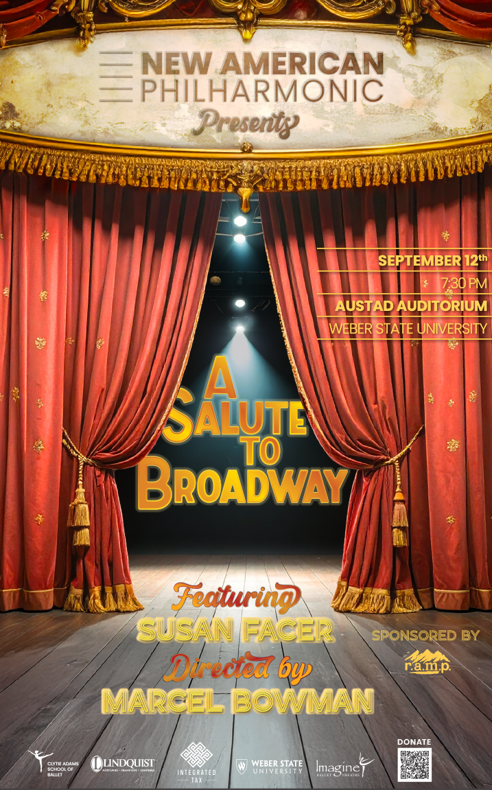
A Salute to Broadway. A curtain and almost nothing else. From across a room that is all a poster gets, and the sponsor row still reads as one quiet line at the foot.

Then it has to turn into a program by the night of the concert, and a square crop, and a wide crop, and the university's ad slot, without becoming four different designs.

What I did

A fixed frame and a free middle.

The frame that never moves

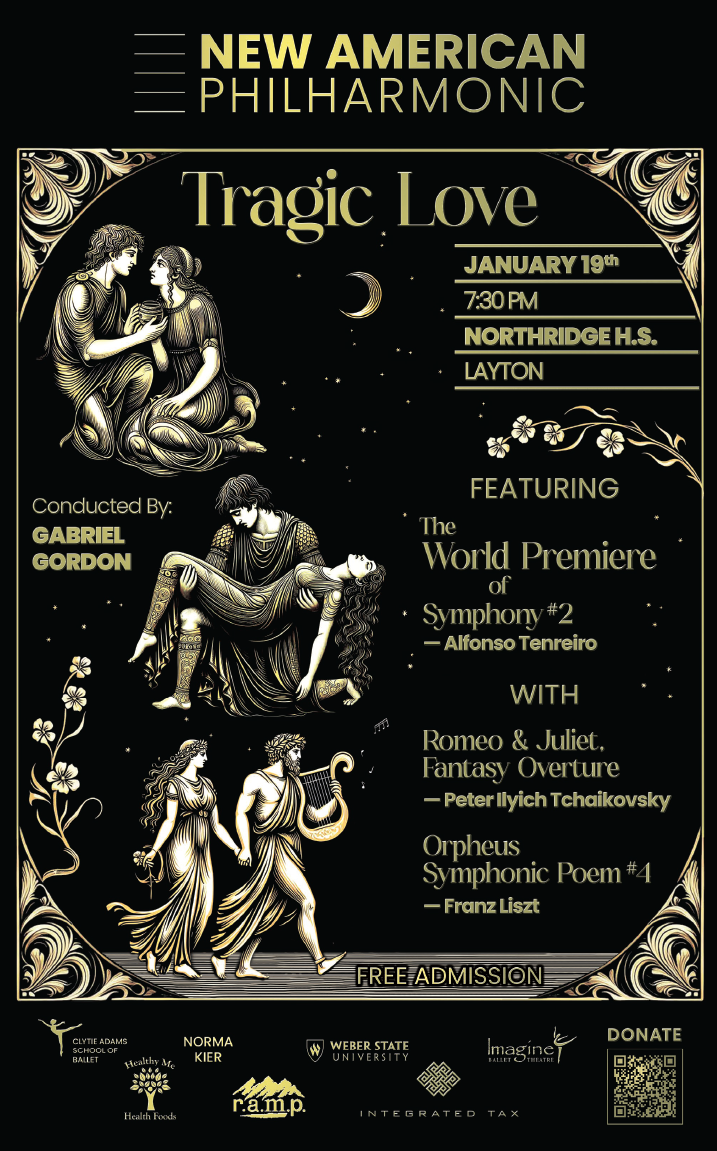
Masthead across the top, date block top right, sponsor row along the bottom with the free-admission line and the donate code. Every poster since the first has had these in the same places, and that is what people recognise before they have read a word. Every sponsor mark was rebuilt to one height and one weight, with a dark-background set for the posters that need it, so a row of logos reads as one line of credit.

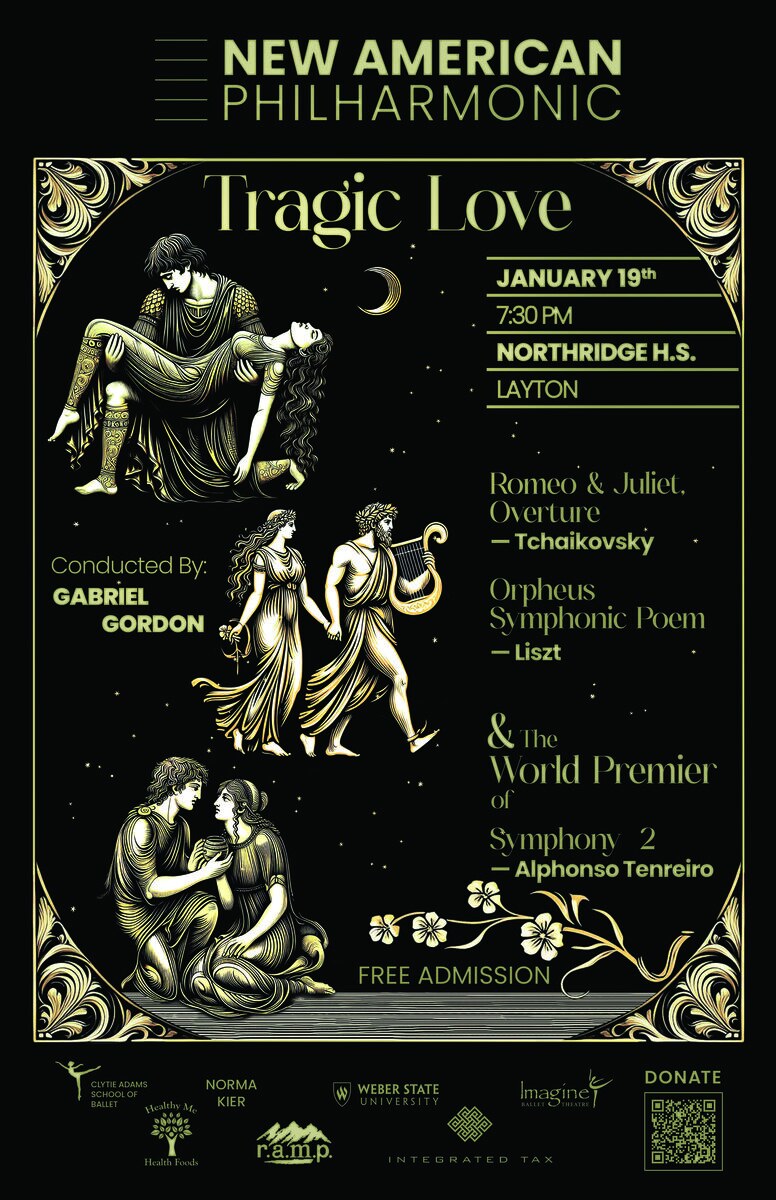
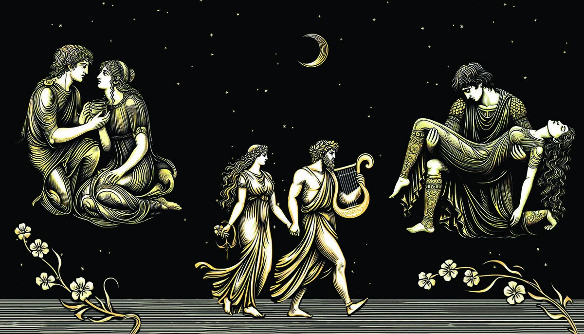
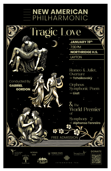
Tragic Love. Romeo and Juliet, Orpheus and a world premiere, gold on black. Cover the middle of this poster and the bottom four inches are the same as every other one.

The middle belongs to the music

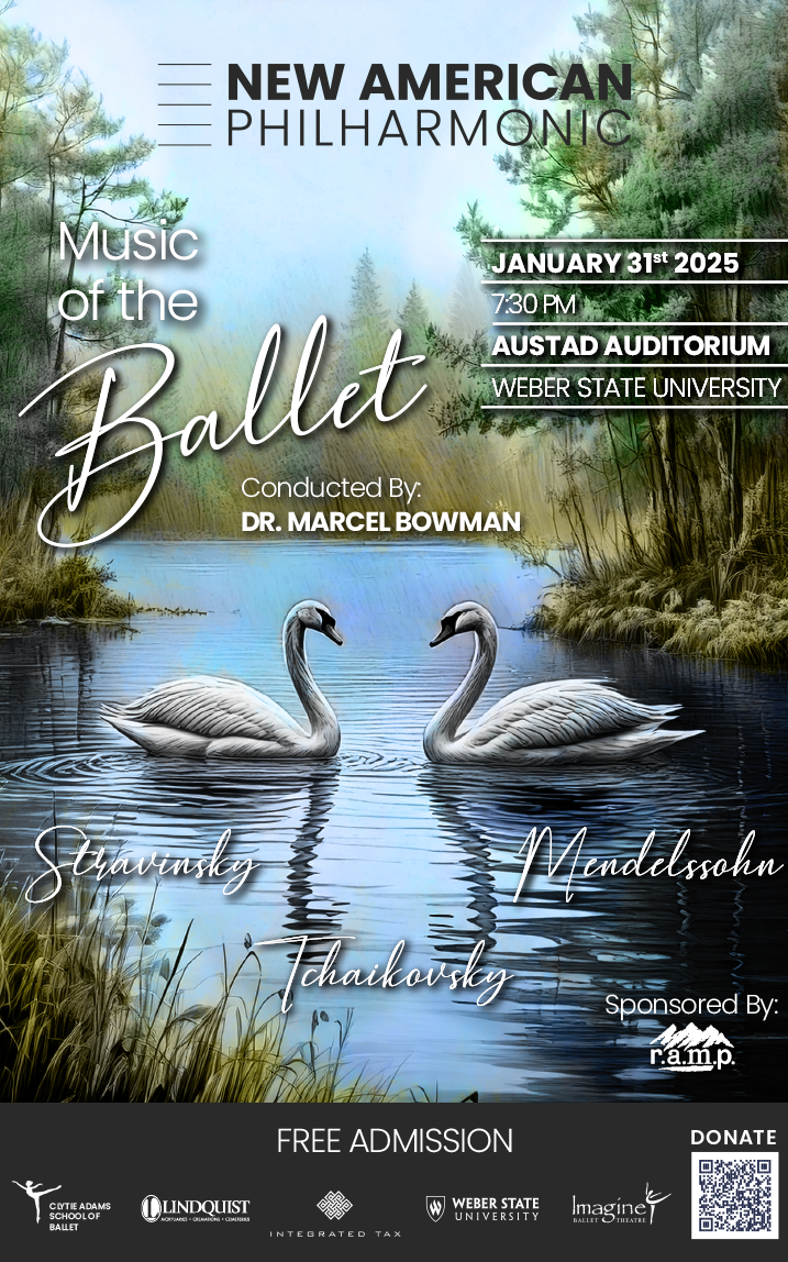
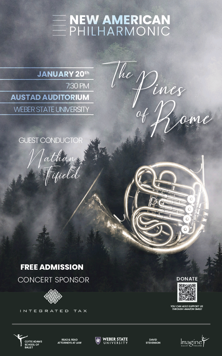
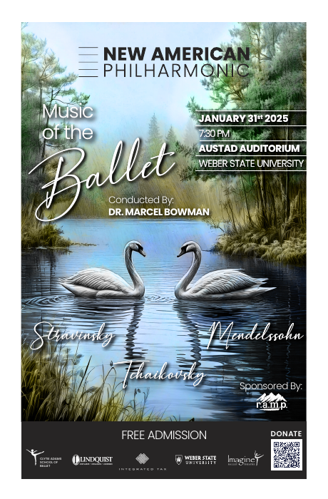
Everything inside the frame starts again each time: swans for the ballet, a french horn for Pines of Rome, a theatre curtain for Broadway, a piano for Spain to Bohemia. The type changes with it. The frame is what makes that freedom safe.

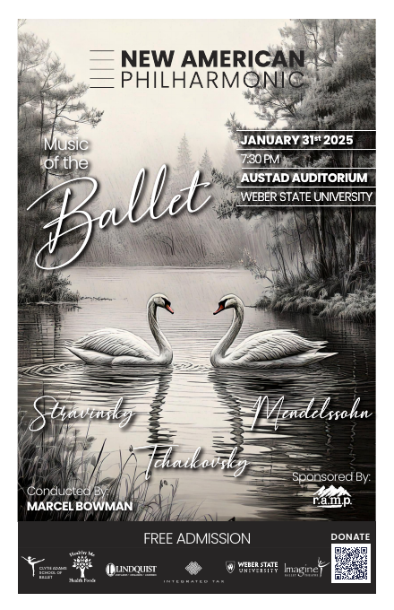
Music of the Ballet
Pines of Rome
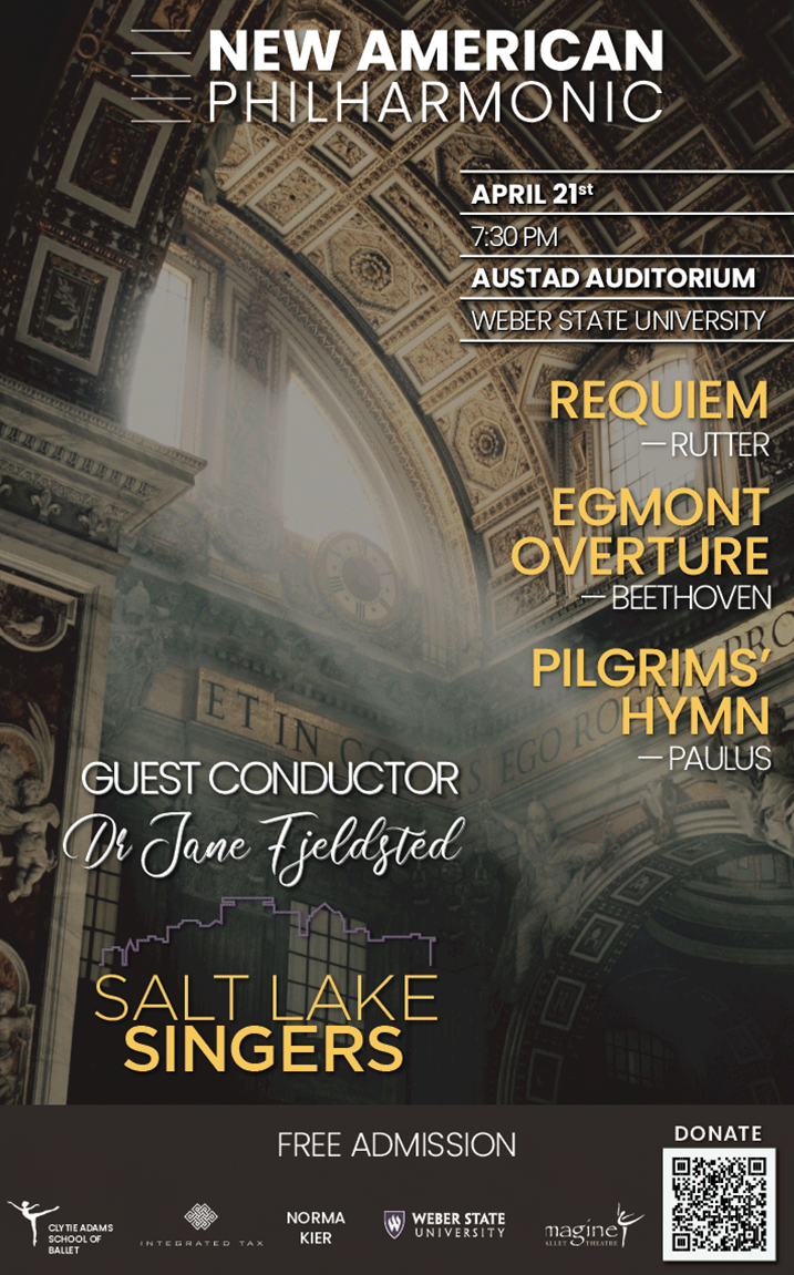
With the Salt Lake Singers
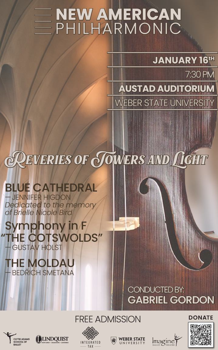
Reveries of Towers and Light
Four worlds. Swans, a french horn, a chorus in an old church, arches against the curve of an instrument. Nothing in the middle repeats; everything around it does.
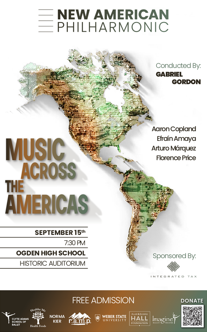
Music Across the Americas. North and South on one sheet: the hardest kind of programme to picture, and the clearest test of a frame that can hold anything.

One file, every piece, press-ready

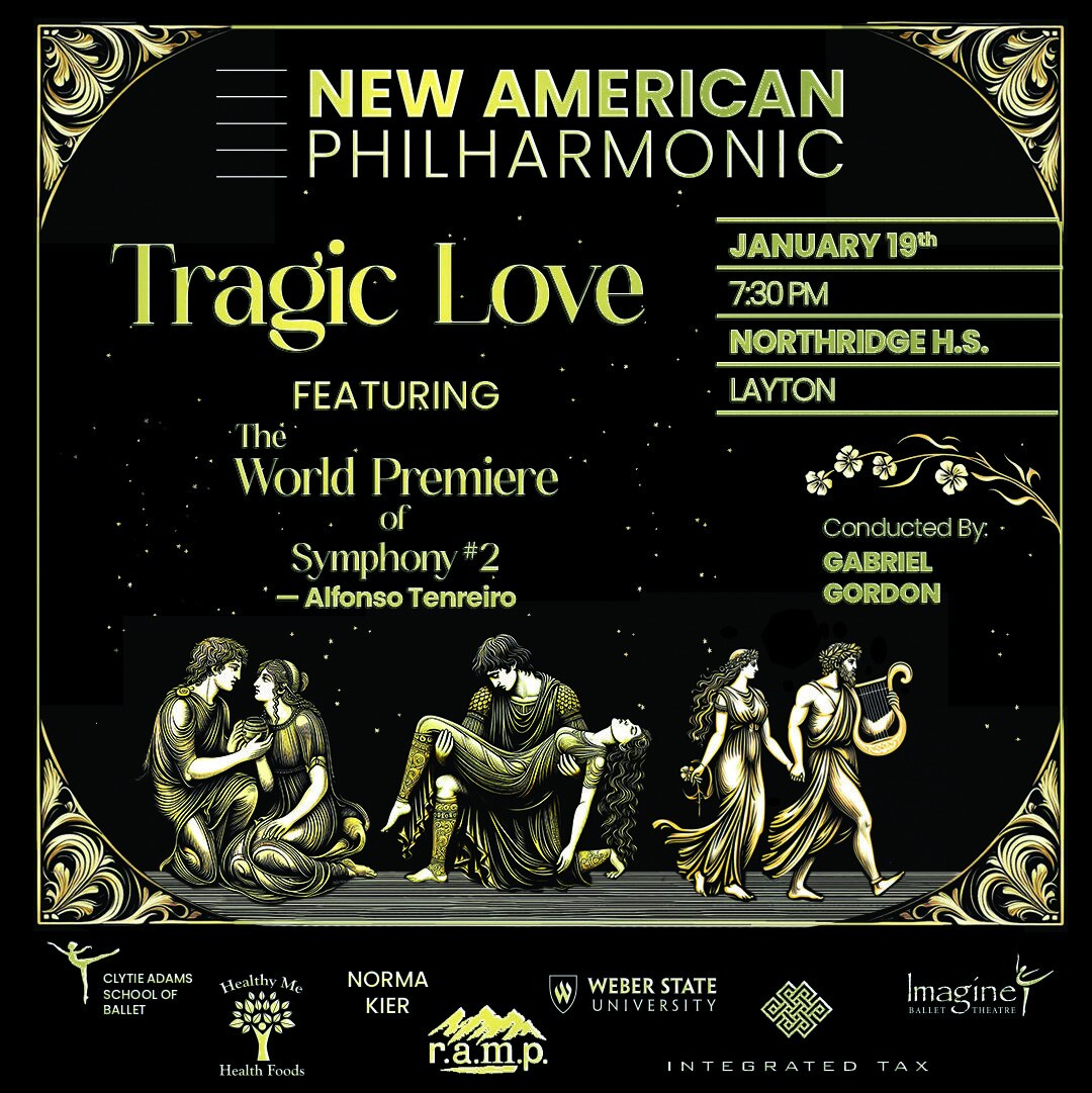
The poster is the master. The program cover, the social square and wide, the digital promo and the Weber ad are exports of the same file, so a changed date or a late sponsor changes once. Two poster sizes go out print-ready, a program for print and one for screen, and crops sized for where they go. The orchestra's volunteers never open a design file.

Poster, 11 × 17 and letter
Program, folded to letter
Social crop, mauve for screens
Web image
One concert, the whole set. Every export comes from one file. A late sponsor or a changed start time is one edit, not four, which is why a volunteer can post the right thing at nine at night.
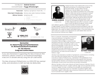
Inside the program. Conductor, concertmaster, the orchestra by section, the sponsors again, and the programme notes, set in the poster's own type.
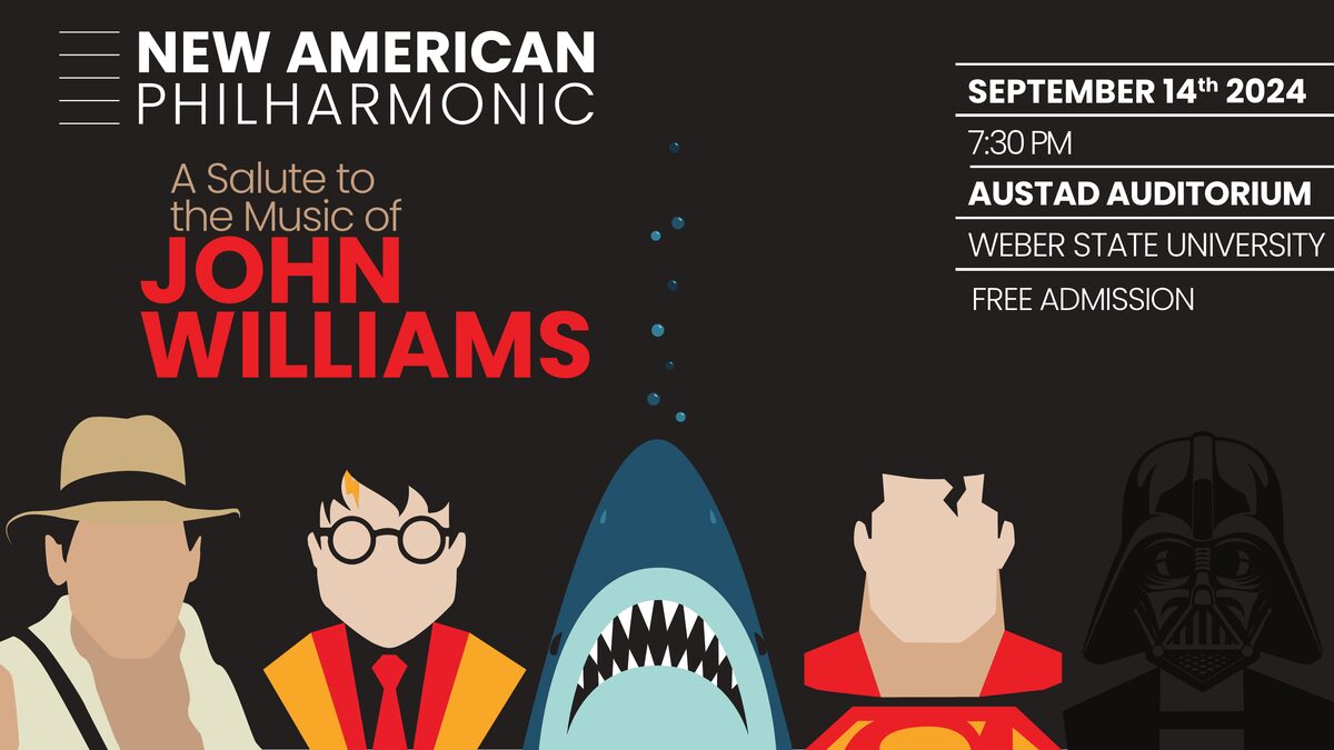
John Williams, digital promo. The wide format for screens. The characters carry it, so the title does not have to.
Look at the bottom of any two posters, not the top. The brand is there.
How a poster gets there

The first draft is an argument about the concert.

Nothing arrives finished. The first pass settles the picture and nothing else; colour, the title treatment and the sponsor row come once the drawing is working. Most concerts settle in two rounds.

Swan Lake, draft one
Draft two
Tragic Love, draft one
Draft two, the same day
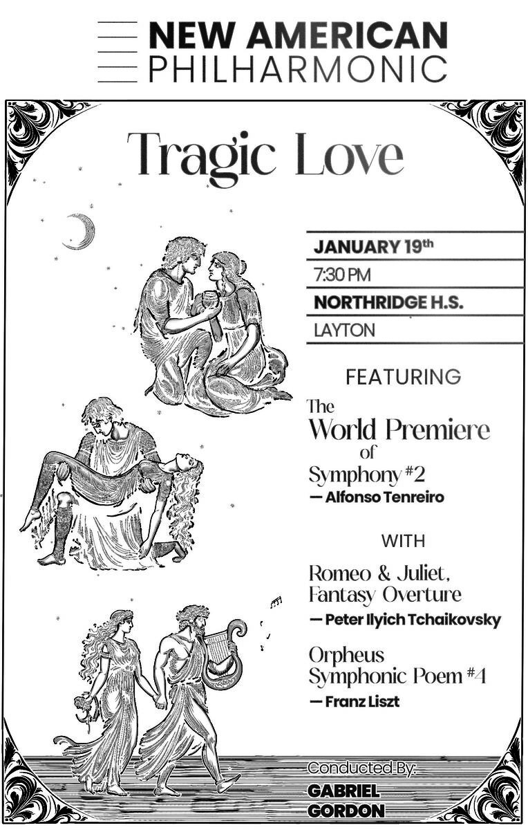
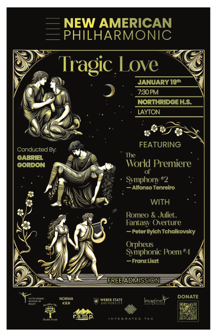
Drafts. Swan Lake in pencil and fog before any colour; Tragic Love's "Featuring" layout, which lost. You see a handful like these, each a different idea, carrying the same content.
What happened

Season after season, venue after venue, and a frame that held.

Several concerts a season without a gap. The orchestra has moved from a high-school auditorium to a university concert hall, added a university ad slot to the set, and picked up and lost sponsors along the way. The poster absorbed all of it without anyone having to decide again what an NAP poster looks like.

A year after the ballet concert they asked for that poster again, re-exported.

Next season's schedule is already on my desk: a fall concert, the Nutcracker, a winter and a spring concert, and a pops night with fireworks. The frame is ready before the programmes are.

Why it matters to you

Decide once what never moves, then let everything else move.

A concert series, a lecture season, a festival, a run of product launches: anything that happens repeatedly and has to feel both new and yours has this problem. A template makes everything the same. A free-for-all makes nothing recognisable. The answer is to decide once what never moves, then let everything else move.

You would get the frame, the sponsor row, one file that becomes the whole set, and exports your printer and your social-media volunteer can both use without asking.

Have something like this? Email me.

Tell me what you're making and when you need it. I reply within a day. What to include

Next case study · 1 of 2 Marathon Co.: eight jewelry brands, one system →