Weber State University · a lecture series and a nursing programPrint, pins and a page · poster, five enamel pins, a messenger bag, a tri-fold and its web pageInside the university's brand standards
A university has a mark, a purple and a set of rules. Both of these had to look like the university first and like themselves second.
Role
Designer
Made
Teacher Twilight Series: poster, five collectible pins, the bag they go on · Nursing: a tri-fold and the web page that goes with it
Hard part
Two audiences, one purple, no room to invent a look — the character has to come from the drawing and the words
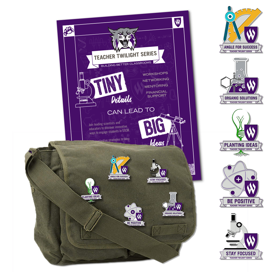
The Teacher Twilight Series is a run of evening sessions for schoolteachers: workshops, networking, mentoring and financial support, pitched as a way to find new ways of teaching science. The poster carries the line the whole thing is built on, tiny details can lead to big ideas, with a microscope on one side of it and a telescope on the other, and a faint blackboard of formulas running behind everything.
The set. The poster, the five pins, and the messenger bag they were pinned to. All of it in the university's purple, with the Wildcat and the W shield exactly where the standards put them.
What I did
A pin for every idea.
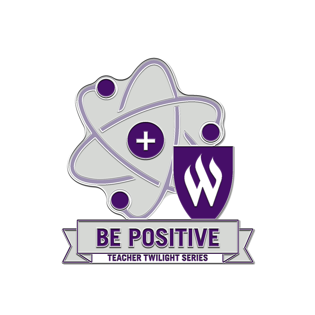
The pins are the part people kept. Five of them, one per theme, each a piece of lab equipment or a science symbol drawn as a badge, with the W shield tucked into it and the theme on a ribbon underneath: Angle for Success, a compass and protractor; Organic Solutions, a flask with a molecule rising out of it; Planting Ideas, a lightbulb with a plant growing inside and roots out of the bottom; Be Positive, an atom with a plus sign at its centre; Stay Focused, a microscope.
They are drawn for hard enamel: flat colour, every shape closed, lines thick enough to be a metal wall between two fills, and small enough text that it was set in a single weight and never below the size the pin maker could hold. The same discipline as the trading pins, in a palette of four colours instead of a team's.
Angle for Success
Organic Solutions
Planting Ideas
Be Positive
Stay Focused
The five, at size. On their own and large enough to see how each one is built: a shape, a shield, a ribbon, four colours.
The second job
Together we save lives.
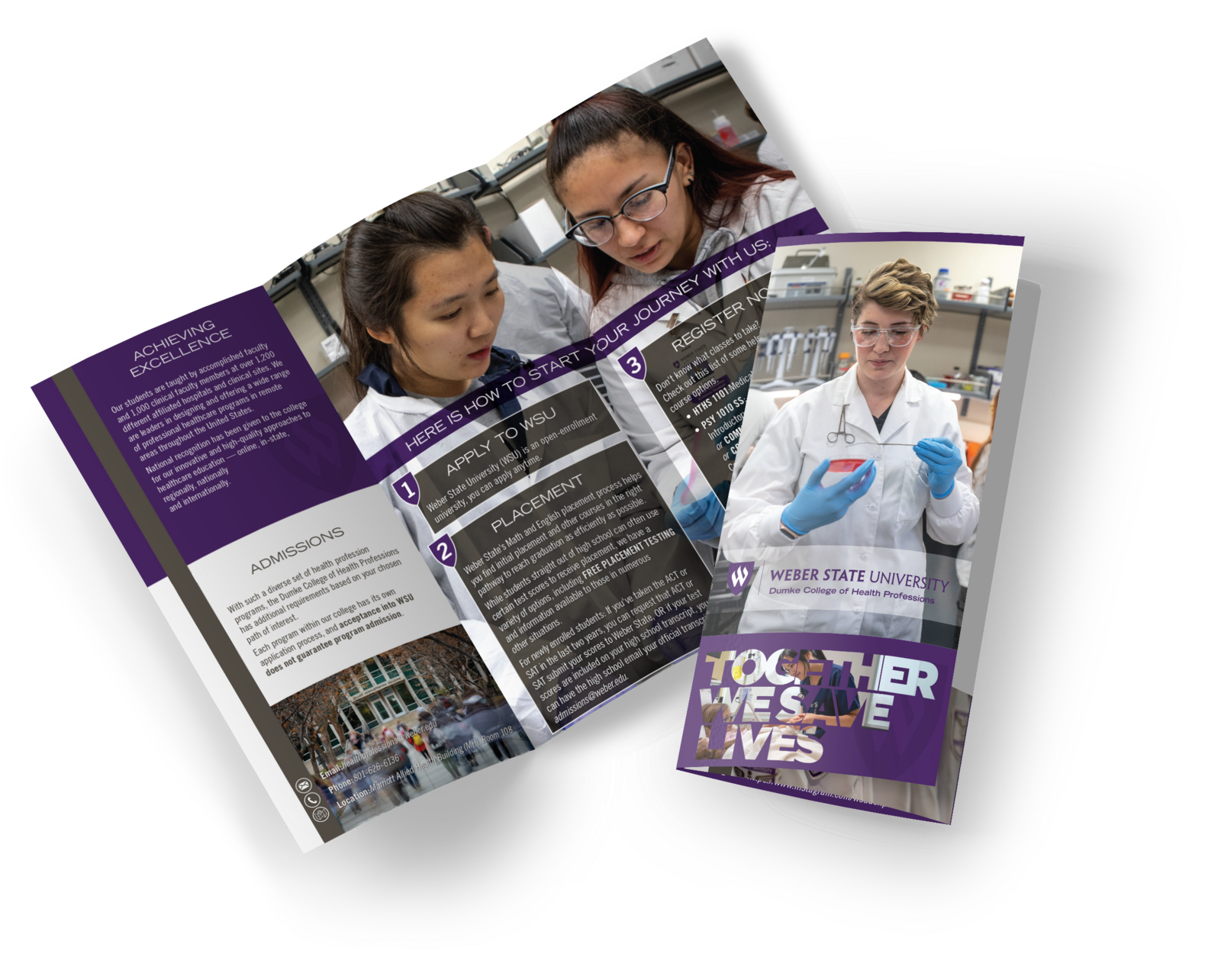
The nursing program needed a tri-fold for prospective students, inside the same standards. The cover is a student in a lab coat and gloves and three words over the purple: Together we save lives. Inside, the panels walk through how to start, one, two, three, over photographs of students at the bench, with the program's details in the purple column on the left.
The tri-fold. Cover and the open inside. Photography does the recruiting; the purple frames it and carries the steps.
The brochure has a web page to match: the same photographs, the same three steps and the same line, laid out for a screen, so a student who picked up the tri-fold at a fair and the one who found the program online see one thing.
The top of the page
The steps
The web page. The tri-fold's companion on the program's site. The cover photograph and Together we save lives at the top, then the three steps, each numbered in a shield over the bench photographs, so print and screen say one thing.
Why it matters to you
Working inside a standard is its own skill.
Most of the design a university, a hospital or a large company needs is not a new look. It is work that has to pass the brand office and still have a reason to be picked up. That means knowing the rules well enough to find the room inside them: in the drawing, the photography and the line, not in the colour. The pins and the brochure share a purple and a shield and are plainly two different things.
Have something like this? Email me.
Tell me what you're making and when you need it. I reply within a day. What to include